Tuesday, November 30, 2010

Two-Way Binding on TreeView.SelectedItem

In this post I’m going to describe an attached-behavior for a TreeView control that allows you to achieve two-way binding on the SelectedItem property. You can grab the source code here.

[UPDATE 6 Dec 2010]: I fixed a bug that was causing it to fail to update the TreeView when the selected node was set (through binding) before the view had loaded.

Background

If you have ever tried using the TreeView control with it’s ItemsSource bound to some kind of data context then you probably know how frustrating it can be to work with the SelectedItem property. This is especially true if you are trying to follow an MVVM pattern.

Typically when you use an ItemsControl you want to create a two-way binding on two of its properties: ItemsSource and SelectedItem. But TreeView, unlike other ItemsControl subclasses, has a read-only SelectedItem property which means no two-way binding like this:

<sdk:TreeView 
ItemsSource="{Binding TreeNodes}"
SelectedItem="{Binding SelectedNode, Mode=TwoWay}"/>


There are a number of workarounds for this challenge (and it is a challenge – just try a Google search for Silverlight TreeView SelectedItem) but most of the solutions I’ve read either seem too complex to use, require you to compromise the MVVM pattern, or are unfriendly with Blend. Wouldn’t it be nice if you could just attach a behavior to the TreeView to make it work?


BindableTreeViewSelectedItemBehavior


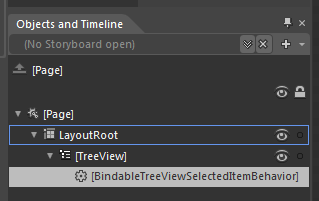
Yeah – it’s a long name for a behavior, but at least you know what it does just by reading its name. Using it in Blend is pretty easy:


Using the Behavior in Blend


Just drop it on the TreeView control and set its Binding property.The XAML binding will look like this:


<sdk:TreeView ItemsSource="{Binding TreeNodes}" ...>
<i:Interaction.Behaviors>
<Behaviors:BindableTreeViewSelectedItemBehavior
Binding="{Binding SelectedNode}"/>
</i:Interaction.Behaviors>
</sdk:TreeView>


You don’t need to make it a two-way binding, the behavior looks after that for you. Here is a sample application that has two TreeView controls bound to the same data context. If you change the selected item on one TreeView it will update the selected item on the other TreeView:


Under The Hood


This attached behavior works by acting as a go-between using the TreeView.SelectedItemChanged event, the TreeView.SelectedItem property, and a private two-way binding on the data context. Here is a diagram that shows how the behavior wires itself up:


Diagram of relationships for behavior


Click on the diagram to see a larger version. The diagram can be broken down as follows:


  • The behavior examines it’s Binding property and uses that information to create a private two-way binding between the property on the data context of the tree view (in our example it’s against the SelectedNode property) and the behavior’s private SelectedItemProperty DependencyProperty.
  • When the value for the DataContext’s SelectedNode property changes, the change event for the SelectedItemProperty DependencyProperty (AssociatedObjectSelectedItemChanged) fires and we set the new value on the TreeView using the TreeView.SelectedItem property. This allows the tree view to have its selected item set from the data context.
  • The behavior also attaches an event handler for the TreeView.SelectedItemChanged event (also called SelectedItemChanged) which fires whenever the user changes the selected item.
  • When the SelectedItemChanged event handler is called, the behavior updates the value of its SelectedItemProperty DependencyProperty. This allows the data context to have its SelectedNode value updated when the user changes the selected item in the TreeView.

Summary


In this post I described an attached behavior that lets you achieve two-way binding on the TreeView.SelectedItem property. The behavior is especially useful if you are using the MVVM pattern to keep your views and view models separate, and want to avoid code in the View’s code-behind file. The source can be downloaded here.
Tuesday, November 23, 2010

A Behavior for Remembering Settings

I have been unusually busy for the last couple of months and have been neglecting my blog. Things are still pretty busy, but I hope to squeeze out a few posts if I can.

In this post I’m going to describe a behavior that you can attach to your controls and bind to a property on that control. The behavior will monitor the value of that property and store any changes to it in Isolated Storage. The next time you start the application the behavior will look in Isolated Storage and load the value if it can find it, then restore the value to the control. This is a handy behavior for things like grid splitters, sliders, or similar types of controls (dial’s too!) where you want any changes the user makes to be remembered the next time they run your app.

Demo Application

You can grab the behavior here. And this is the behavior in action:

If you refresh this page, the application will remember the opacity value for the border control, the position of the grid splitter, and the selected index of the list.

Using the behavior looks like this:

   1: <Border x:Name="border">
   2:     <i:Interaction.Behaviors>
   3:         <TotalRecall:TotalRecallBehavior Binding="{Binding Opacity, ElementName=border}"/>
   4:     </i:Interaction.Behaviors>
   5: </Border>

There are two things worth discussing about this behavior; the Binding to a control’s property and the the storing/retrieving using Isolated Storage.


Binding to a Control’s Property


The XAML above shows the TotalRecallBehavior being used to remember the opacity of the border element. Internally, the behavior needs to know when the property being bound to (in this instance it is the Border.Opacity property) changes value so it can store it away for next time. To do this, the behavior has an internal DependencyProperty called BindingValueProperty that it uses to create another two-way binding to the same property on the control. BindingValueProperty has an event handler for when the value changes so it can store the new value in Isolated Storage.


The code that uses the behavior’s Binding property to set up a private two-way binding looks like this:


   1: private void CreateBindings()
   2: {
   3:     var expression = this.ReadLocalValue(BindingProperty) as BindingExpression;
   4:     var watcher = new Binding();
   5:     if (expression.ParentBinding.Source != null)
   6:     {
   7:         watcher.Source = expression.ParentBinding.Source;
   8:     }
   9:     else
  10:     {
  11:         watcher.ElementName = expression.ParentBinding.ElementName;
  12:     }
  13:  
  14:     watcher.Path = new PropertyPath(expression.ParentBinding.Path.Path);
  15:     watcher.Mode = BindingMode.TwoWay;
  16:     BindingOperations.SetBinding(this, BindingValueProperty, watcher);
  17:  
  18:     this.recallValue = new RecallValue(this.AssociatedObject.GetType().Name + "." + 
  19:         AssociatedObject.Name + "." + expression.ParentBinding.Path.Path);
  20: }

The call to “this.ReadLocalValue(BindingProperty) as BindingExpression” is exactly what UIElement.GetBindingExpression() does, but the Behavior is not a UIElement so I just make the same call. Getting hold of the BindingExpression is important since it gives us access to the correct binding source and property path. The BindingExpression only exists on the source object of the binding (even if it is two-way), so on line 2 of the XAML snippet the binding is set on the behavior and must therefore be read from the behavior with the call to ReadLocalValue (line 16 of the C# code above). If you try and read the BindingExpression on the element being bound to you will get null returned.


The behavior sets up the binding and creates an instance of the RecallValue class. I have future plans for the RecallValue class, but for now it is simply a wrapper around a string value.


Using the ApplicationSettings on IsolatedStorage


You can use isolated storage to store all kinds of information on the user’s local machine. You can read all about local storage in Silverlight here. One of the less frequently covered uses of Isolated Storage is the IsolatedStorageSettings.ApplicationSettings static property. This property is an IDictionary and has an indexer you can use to read and write with. These are very handy for storing atomic name-value pairs; exactly the kind of thing I want to do with this behavior.


The code that read’s the value from isolated storage is as follows:


   1: if (IsolatedStorageSettings.ApplicationSettings.Contains(this.recallValue.Key))
   2: {
   3:     this.recallValue.Value = (string)IsolatedStorageSettings.ApplicationSettings[this.recallValue.Key];
   4: }
   5: if (null != this.recallValue.Value)
   6: {
   7:     this.SetValue(BindingValueProperty, this.recallValue.Value);
   8: }

The value is read from isolated storage if it exists, and set as the value for our private BindingValueProperty dependency property, which is by now two-way bound to the control’s property. The IsolatedStorageSettings class takes care of creating a location in isolated storage for the values so there’s no other code needed for setting up file streams and creating directories etc. 

Similarly, the code for writing to the isolated storage settings is as follows:


IsolatedStorageSettings.ApplicationSettings[behavior.recallValue.Key] = behavior.recallValue.Value;


The rest of the behavior is just plumbing.


Future Improvements


As I said earlier, I have plans for the RecallValue class. I want to support the saving/restoring of complex objects and values that don’t parse easily to and from string.


I would also like to improve the design-time experience – the Binding type doesn’t play very nice with Blend’s element binding design tool, so I can’t use the CustomPropertyValueEditor attribute. I would really like the design time property editor for the Binding to list the properties on the attached object the same way the ChangePropertyAction does.


Summary


In this post I’ve described a behavior that remembers the value of a property on the control it is attached to. I described the use of the BindingExpression class to create a private two-way binding, and described how to use the IsolatedStorageSettings.ApplicationSettings dictionary. In the code download there are examples of the behavior being used on different kinds of controls and properties.

Monday, September 6, 2010

A Tiled Image Brush for Silverlight

The Silverlight ImageBrush does not support the TileMode property that exists in WPF, and as a result there is no built in way to have tiled images as a background brush for your controls and styles.

The following control may be useful to you if you find yourself wanting to achieve the same things as a WPF tiled image brush.

You can grab the source here. It is a control that behaves like a Border control, except that it also has a TiledImageSource property that you can use to select an image resource from the project.

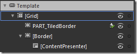
The TiledBGControl control (um, didn’t think too hard about naming it) is a viewless control, so you can change its default control template the same way you can for any other control. This is the structure of the default control template:

ControlStructure

The template has a grid with two Border controls in it. The back-most Border  (the first one) is a control part that must exist, the source code of the control looks for this control and applies a shader effect to it to produce the tiled effect. The second Border is simply to provide the visible border around the control. I can’t use the first Border control to draw the visible border because all the pixels of that Border control (including the visible border) are replaced by the shader effect. The ContentPresenter is placed in the second Border control so that it appears on top of the tiled background.

The following two sections give a quick description of the pixel shaders and then an overview of how the control works.

Wrapping up a Pixel Shader

I’ve gone looking for a tiled image brush for Silverlight before. It’s just not possible (to the best of my knowledge) to create in Silverlight the same kind of tile brush that WPF has. The closest I’ve seen to accomplishing this effect is with a pixel shader. A pixel shader is a set of instructions that can change the pixels in a given area. For example, the built in Silverlight blur and drop-shadow effects uses a pixel shader. The instructions are written in a language called HLSL, compiled, and wrapped up in the .Net framework ShaderEffect class.

Walt Ritcher’s excellent free Shazzam tool can be used to create and test pixel shaders. It comes with a shader called “Tiler”, authored by A.Boschin, that allows you to achieve the tiled background effect but it is a little awkward to use as-is for a fluid interface. The Tiler shader has four properties for controlling how it is applied:

  • VerticalTileCount – how many tiles to squeeze in vertically in the given space
  • HorizontalTileCount – how many tiles to squeeze in horizontally in the given space
  • HorizontalOffset – a horizontal offset to apply to the first tile
  • VerticalOffset – a vertical offset to apply to the first tile

Using a shader like this is a little awkward because a shader doesn’t know how big an area it is being applied to (in pixels). It processes each location in the area by using a value between 0 and 1 for an x and y coordinate. If you want to keep the tile image at a 1:1 scale, you need to calculate how many tiles fit into the area the shader is applied to, and update this every time the area changes size. In WPF, the pixel shaders are executed on the GPU which saves the CPU for application logic, but Silverlight does not use the GPU (and probably never will), so the shaders must be used sparingly to prevent the CPU from slowing to a crawl.

I used the Tiler sample shader as a starting point and modified it, replacing the properties above with these ones:

  • TextureMap – the tile image to repeat as a background
  • DestinationHeight – the height of the destination area. This needs to be updated as the target area changes size
  • DestinationWidth – the width of the destination area. This also needs to be updated as the target area changes size
  • TileHeight – the height of the tile to be repeated as a background
  • TileWidth – the width of the tile to be repeated as a background

The main reason I did it this way was to learn HLSL; I could have just as easily used the same approach as the Tiler shader and calculated the number of vertical and horizontal tiles when the container changed size. The code for my pixel shader is as follows:

   1: /// <class>TilerXY</class>
   2: /// <description>Pixel shader tiles the image to size according to destination width and height</description>
   3: ///
   4:  
   5: // Created by P.Middlemiss: phil.middlemiss@gmail.com
   6: // blog: http://silverscratch.blogspot.com/
   7:  
   8: sampler2D TextureMap : register(s2);
   9:  
  10:  
  11: /// <summary>The height of the target area.</summary>
  12: /// <minValue>0</minValue>
  13: /// <maxValue>3000</maxValue>
  14: /// <defaultValue>300</defaultValue>
  15: float DestinationHeight : register(C1);
  16:  
  17: /// <summary>The width of the target area.</summary>
  18: /// <minValue>0</minValue>
  19: /// <maxValue>3000</maxValue>
  20: /// <defaultValue>300</defaultValue>
  21: float DestinationWidth : register(C2);
  22:  
  23: /// <summary>The height of the tile.</summary>
  24: /// <minValue>0</minValue>
  25: /// <maxValue>500</maxValue>
  26: /// <defaultValue>100</defaultValue>
  27: float TileHeight : register(C3);
  28:  
  29: /// <summary>The width of the tile.</summary>
  30: /// <minValue>0</minValue>
  31: /// <maxValue>500</maxValue>
  32: /// <defaultValue>100</defaultValue>
  33: float TileWidth : register(C4);
  34:  
  35: sampler2D SourceSampler : register(S0);
  36:  
  37: float4 main(float2 uv : TEXCOORD) : COLOR
  38: {
  39:     float xx = ((uv.x * DestinationWidth % TileWidth) / TileWidth);
  40:     float yy = ((uv.y * DestinationHeight % TileHeight) / TileHeight);
  41:     float2 newUv = float2(xx , yy) ;
  42:     float4 color= tex2D( TextureMap, newUv );
  43:     float4 source = tex2D( SourceSampler, uv);
  44:     color *= source.a;
  45:     return color;
  46: }


I’m still learning HLSL so I’m sure the code above could be improved. I have a fairly new computer and the CPU doesn’t really budge at all when using this component, but I would be interested to hear back from anyone with an older PC to see if performance is an issue, or from anyone who can suggest improvements to the HLSL.


The TiledBGControl


The TiledBGControl wraps up all of the awkwardness of using the pixel shader and lets you just supply the image source to use. The OnApplyTemplate method is overriden and carries out the following tasks:


  • The control looks for the template part called “PART_TiledBorder” and attaches the above shader effect to it.
  • An ImageBrush is created using the supplied TiledImageSource value and set as the value of the TextureMap property of the shader.
  • An event is attached to the border that updates the DestinationHeight and DestinationWidth when the border changes size.

The TileWidth and TileHeight properties of the shader have to be updated whenever the TileImageSource changes. The TileImageSource is a property of type ImageSource and is used as the value for the ImageBrush. There are a couple of things to know about the ImageBrush and ImageSource classes:


  • An ImageSource is not evaluated until is used, which means you don’t necessarily know the size of the image when you assign it.
  • The ImageBrush fires an ImageOpened event when the ImageSource is resolved
  • The resolved image is cached, so if you set the ImageSource to a value that has already been resolved you won’t get an ImageOpened event fired again.
  • The ImageSource, once resolved, can be cast to the BitmapImage type which has the PixelWidth and PixelHeight properties
  • Setting the ImageBrush.Stretch mode to None does not give the desired result – I thought it would just render the image in its actual size, but it doesn’t. I used Stretch.Fill instead

The code for creating the ImageBrush from the provided ImageSource is as follows:


   1: ImageBrush brush = new ImageBrush();
   2: brush.ImageSource = this.TiledImageSource;
   3: bool isOpened = 0 != ((BitmapImage)brush.ImageSource).PixelWidth;
   4: if (!isOpened)
   5: {
   6:     // we don't have the size yet so work that out when the ImageSource is resolved
   7:     brush.ImageOpened += (sender, args) =>
   8:         {
   9:             brush.Stretch = Stretch.Fill;
  10:             this.tilerXY.TileWidth = ((BitmapImage)brush.ImageSource).PixelWidth;
  11:             this.tilerXY.TileHeight = ((BitmapImage)brush.ImageSource).PixelHeight;
  12:         };
  13: }
  14: else
  15: {
  16:     brush.Stretch = Stretch.Fill;
  17:     this.tilerXY.TileWidth = ((BitmapImage)brush.ImageSource).PixelWidth;
  18:     this.tilerXY.TileHeight = ((BitmapImage)brush.ImageSource).PixelHeight;
  19: }
  20: this.tilerXY.TextureMap = brush;

The tile images in the sample above are from www.repeatxy.com. I’ve put the control up on the Expression Gallery, so feel free to grab the source and use it according to the license there.

Monday, August 23, 2010

Redial – A Dial Custom Control

In the last post I described a Dial User Control and promised I would turn it into a Custom Control. Re-doing it as a viewless custom control means it can be visually redesigned without having to write any behavior code.

Here is the control with a couple of different styles, with some of the dials bound to an items source. I also added an animation for the dial positions being added and removed. You can see this by changing the value of the big dial in the bottom left corner; its value sets the MaxValue of the top left dial.

You can grab the source here.

There are a couple of features in this control that weren’t in the User Control:

  • The ItemsSource property can be bound to a data source for the dial position items. If you use this then don’t use MaxValue since that is automatically determined from the data source.
  • If you don’t use an items source, the positions are auto-generated using the StartValue and MaxValue properties.
  • I added very basic support for the mouse wheel, but it needs improvement.
  • I changed the behavior of the RotationAngle property to take into account any initial rotation of the list box path, and also the span of the path.
  • You can click and drag around the dial positions to set the value

A Simple Style

orientations

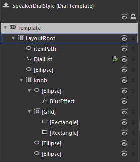
The template to the left shows the entire template for the black speaker-style dials in the top right of the sample application above. This is a good starting point for creating styles for the dial since it is very simple.

There are three key elements to note:

  1. The “itemPath” element is the ellipse that defines where the dial positions end up.
  2. The “DialList” element is the path list box that uses the itemPath. The Dial control won’t work without this. Any style for the Dial control must include a PathListBox control called “DialList”.
  3. The “Knob” grid contains the visual elements that are rotated – more about this below.

The remaining elements are not doing anything interesting other than adding to the visual appearance of the knob.

In order to get the knob to rotate, I have bound it to the RotationAngle property:

   1: <Grid x:Name="knob" Margin="10" RenderTransformOrigin="0.5,0.5">
   2:     <Grid.RenderTransform>
   3:         <CompositeTransform Rotation="{Binding RotationAngle, RelativeSource={RelativeSource TemplatedParent}}"/>
   4:     </Grid.RenderTransform>
   5:  
   6:     ...
   7:  
   8: </Grid>

The RotationAngle property calculates the correct position by looking at the DialList PathListBox, determining the rotation of it, and the span. You may have noticed that I used the “RelativeSource” syntax inside a regular Binding instead of using the TemplateBinding syntax. I did this out of habit, since elsewhere I use property converters on bindings in the other templates, and the TemplateBinding class does not support converters.


Here is an example that uses a converter:


   1: <LinearGradientBrush EndPoint="0.5,1" MappingMode="RelativeToBoundingBox" StartPoint="0.5,0">
   2:     <LinearGradientBrush.RelativeTransform>
   3:         <CompositeTransform CenterY="0.5" CenterX="0.5" 
   4:             Rotation="{Binding RotationAngle, RelativeSource={RelativeSource TemplatedParent}, Converter={StaticResource negativeConverter}}"/>
   5:     </LinearGradientBrush.RelativeTransform>
   6:     <GradientStop Color="Black" Offset="1"/>
   7:     <GradientStop Color="#FF3B3B3B"/>
   8: </LinearGradientBrush>

Feel free to use this control in your own projects.

Saturday, July 31, 2010

A Dial (User) Control

I’ve had a busy month on the road visiting clients (and catching up afterwards), so my blog has been pretty quite. But I’ve finally had some time to sit down and play with a couple of ideas I’ve had around using the path list box. I’ve been wanting to make a dial control for quite a while and when the path list box came along in Silverlight 4 it sparked a couple of ideas of how I might do it fairly easily.

Here is a sample application with a single Dial UserControl scaled to a couple of different sizes. At the moment, the only way to change the value of the dial is to click on one of the numbers or lights (one goes to eleven):

You can grab the source here, although at this stage it is still in the “experimental” phase (and I think I left a couple of unused test control templates in there) so play with it at your own risk. There is a bit of left over unused code from the process of trying different things out. I also don’t do much in the way of error or bounds checking so it’s probably quite easy to set the Value and MaxValue to values that cause Silverlight and/or Blend to die horribly. I am going to turn it into a fully skinnable custom control with all the right kinds of checks, but thought it worth putting a post up now and going over some of the challenges I faced with this particular control. It has been nearly a month after all.

Working with the PathListBox

I used the PathListBox control for the dial numbers and lights. If you haven’t used the Path ListBox before then here is a good series on it. The finished UserControl has a MaxValue property that lets you specify how many numbers should appear on the dial, but at the start I just had a the shapes for the dial and used a PathListBox with some fixed items in it.

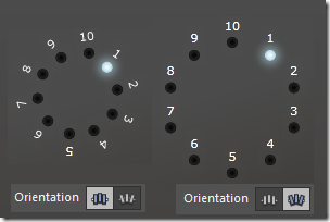
orientations The first challenge was to get the PathListBoxItem control template to show a mix of orientations. There are two kinds of orientations you can have with a PathListBox: None and OrientToPath. The effects of each of these settings can be seen in the image to the right. If I used Orientation = None the numbers end up being rotated. If I use OrientToPath the light ends up below the number.

What I needed was a way to have the numbers use Orientation = None, and the lights to use Orientation = OrientToPath.

The solution was to change the control template setting that Blend creates by default. The outermost grid in the control template has the following XAML when the template is created:

   1: <Grid Background="{TemplateBinding Background}" RenderTransformOrigin="0.5,0.5">
   2:     <Grid.RenderTransform>
   3:         <TransformGroup>
   4:             <ScaleTransform/>
   5:             <SkewTransform/>
   6:             <RotateTransform Angle="{Binding OrientationAngle, RelativeSource={RelativeSource TemplatedParent}}"/>
   7:             <TranslateTransform/>
   8:         </TransformGroup>
   9:     </Grid.RenderTransform>
  10:  
  11:     ....
  12:  
  13: </grid>

I changed this to use two child grids and moved the binding to OrientationAngle into one of the child grids:


   1: <Grid Background="{TemplateBinding Background}" RenderTransformOrigin="0.5,0.5">
   2:     <grid>
   3:         <Grid.RenderTransform>
   4:             <TransformGroup>
   5:                 <ScaleTransform/>
   6:                 <SkewTransform/>
   7:                 <RotateTransform Angle="{Binding OrientationAngle, RelativeSource={RelativeSource TemplatedParent}}"/>
   8:                 <TranslateTransform/>
   9:             </TransformGroup>
  10:         </Grid.RenderTransform>
  11:  
  12:     .... items in this grid will be oriented to the path
  13:  
  14:     </grid>
  15:     <grid>
  16:  
  17:     .... items in this grid will not be oriented
  18:  
  19:     </grid>
  20: </grid>

Now with the PathListBox.Orientation=OrientToPath, only the first grid (containing the light) will rotate, the second grid (containing the number) will be unaffected. Even though the light itself is round and isn’t visually affected by the Orientation, its placement is affected.


Creating the Dial Numbers


I added a Value and a MaxValue dependency property to the UserControl. The MaxValue determines how high the dial goes up to, and the Value determines the current value of the dial. The UserControl has it’s own internal list of items that it recreates whenever MaxValue changes. The PathListBox binds to this list for it’s ItemsSource, and the data template for the PathListBoxItem binds to values on the classes inside the list. This approach reflects a half solution for something that I may or may not do when converting it to a custom control, but the relevant part here is that the list items are driven by the MaxValue property on the UserControl.


Making the Knob


The dial knob presented a couple of challenges. The first was to create the ridged look around its edge. I played with a couple of ideas, but the simplest solution was to use the Star RegularPolygon, which is available under the “Shapes” category in Blend. The RegularPolygon has an InnerRadius property which I set to 98% so that the points are only on the edge, and it has a PointCount property to determine, unsurprisingly, the number of points around the edge. The challenge was that I wanted the dial to work at different sizes, but the PointCount that works for a large dial doesn’t work for a small dial.


I used the Width of the dial to drive the PointCount with a new property on the UserControl and a ValueConverter. I was originally going to just use a ValueConverter and bind to ActualWidth, but there is a known bug where the notification for the change in ActualWidth is not being fired so this always returns 0 to the converter unless the form is resized. The suggested work around is to attach to the SizeChanged event and force a re-layout, but I decided that was too much of a hack, so I added my own DialWidth dependency property and set that to the actual width in the SizeChanged event.


I wrote the ValueConverter to be a generic division converter that returned an integer number; the ConverterParameter can be set to the desired denominator. In the end I could probably have done away with the value converter and DialWidth property and just added my own PointCount property that was recalculated on SizeChanged – and I may yet do that when I convert this into a custom control.


The second challenge was to have the knob rotate to the correct value (including the ridges, center graphic, and position light), but keep the LinearGradient brush fills oriented the same so the light still appears to come from the top:


dialpositionsThe knob is contained within two child grids (I used two to have the lights sit above the drop shadow of the dial). The topmost grid has it’s rotation translation template-bound to a new RotationAngle dependency property on the UserControl which is calculated whenever the Value property changes. The gradient brushes of the shapes that make up the knob have their rotation translation bound to the RotationAngle too, but they also use another simple ValueConverter I wrote to return the negative of the value passed to it. So the gradients are rotated anti-clockwise the same amount that the grid containing the dial is rotated clockwise.


The Next Step


As part of converting it to a custom control, I plan to add some better interaction support. Currently the only way to interact with it is by clicking on the lights or numbers to spin the dial to that position. I will add support for the mouse wheel, and (hopefully) support for clicking the knob and dragging it to the desired position (with snapping). I also plan to structure it so that it’s easy to skin and produce some nicely different styles of dials.


So grab the source if you want to have a look, but be warned – it’s a little messy in there, and the documentation is almost non-existent.