Well - it's a long weekend here in New Zealand due to the Easter holidays, so I have some spare time to do another post in this series earlier than I would otherwise have had.
Open up the solution from the last post - if you haven't been following along so far, you can grab the solution so far here.
Editing the Button Style
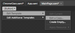
 Select the Border control and create a button inside it about 140x30 in size. Click the "[Button]" button on the breadcrumb trail bar and edit a copy of the button template. Call the new style "ButtonChromeStyle" and be sure to select the "Resource Dictionary" option to create it in our ChromeGlass resource dictionary.
Blend has created a copy of the default style and control template of the button. But before we change the appearance of the elements inside the control template, click the "artists palette" icon in the breadcrumb trail so that we are editing the style itself, and not the control template inside the style.
We are going to define the chrome-looking border so select the BorderBrush property on the Properties tab. The button already has a linear gradient so add 3 more markers to the three already there and define the locations and colors as follows:
- #FFDCDCDC Position 0%
- #FF656565 Position 44.8%
- #FFD8D8D8 Position 68.9%
- #FF2B2B2B Position 92.6%
- #FFE9E9E9 Position 94.8%
- #FF494949 Position 97.2%
We are going to want to reuse this brush again so click the Advanced Properties Options button on the right of the BorderBrush property and select "Convert to new resource...". Call it "ChromeBorder".
Select the Foreground property on the style and change it to white - for some reason, the Button control doesn't seem to inherit the white foreground we set on the UserControlStyle from Part 1 in this series, so we must set it on the style.
Editing the Control Template
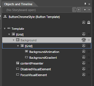
 Now click the "Template" button on the breadcrumb trail to go back to editing the template which looks like the picture on the left.
Select the Background border element in the object tree and select it's BorderBrush. The BorderBrush is bound to the template style that we defined on the actual style - which is the chrome border. Blend sometimes gets confused so if it still shows the old blue linear gradient, don't worry; when we compile and run the solution it will do the right thing.
Now select the Background property and change the "A" (Alpha) value to zero, which should leave a transparent gap inside the button border.
We're going to define our Chrome gradient for the inside of the button so select the BackgroundGradient rectangle in the Object tree and select it's Fill property which is already a linear gradient. The button states (which we will get into later) contain some animation settings for the markers in this existing gradient. We want to clear them and the easiest way to do that is to change it to a solid color, and then change it back to a linear gradient. When you do this you will see a warning appear briefly at the top of the design area warning you that some animations have been deleted. Which is what we want.
Change the color and position of the 5 markers on the linear gradient to these values:
- #FFFFFFFF Position 12.7%
- #FF878787 Position 51.6%
- #FF393939 Position 53.2%
- #FF858585 Position 94.8%
- #FFFFFFFF Position 100%
And change the RadiusX and RadiusY properties both to 2. Also change the CornerRadius of the BackgroundAnimation border element to 2.
Again, we are going to reuse this gradient later so select the BackgroundGradient element (if it's not already selected), click the Advanced Property Options button and convert it to a local resource called "ChromeFill".
Although we are going to reuse this gradient, it's a little bit to bright for the button since we have specified White as the foreground (text) color on the style. We are going to use another rectangle in the button template to correct this rather than change the gradient brush resource we just created.
Select the [Grid] control inside the Background border control in the object tree, and double click the Rectangle icon on the tool palette. Reset it's margin property (which Blend has probably changed) all to 0s and set it's Stroke property to NoBrush. Also, change it's RadiusX and RadiusY values to 2.
Select it's Fill property and set it to be a linear gradient brush with the following 3 markers:
- #4C5F5F5F Position 0%
- #4CDCDCDC Position 23.4%
- #4C000000 Position 65.7%
We may need to use this gradient again so convert it to a local resource called "ChromeDarkeningLinear" (yup - we are going to create a radial one in a later post). The white text back on the button will now show clearly against the background.
Changing the Visual States
The last thing to do is to change the appearance for the various states that the button can be in. Click the "States" tab and you will see all the various states that a button can be in.
Select the "MouseOver" state - any changes we make to element properties now will only take effect when the mouse is over the control (in the running application). The BackgroundAnimation element already has an animation to change the opacity from 0 to 100 (it has the little red circle on it's icon in the object tree), so select the BackgroundGradient element in the Object tree and change it's opacity to 85%. This will allow a bluish color to show through.
Select the "Pressed" state. There will already be an animation for the Background border element (near the top of the object tree), but we want to change it:
- Select the Background border element and set it's background brush to black, but change the A value to 50%.
- Select the BackgroundAnimation element and change it's Opacity to 50%
- Select the BackgroundGradient element and change it's Opacity to 50%
The last thing to do is to introduce a small animation to move between the Normal and MouseOver states a little more smoothly. Click the down arrow on the "Normal" state and choose the "Normal -> MouseOver" menu item. Set the transition duration that appears to 0.2. Now do the same for the MouseOver state (choosing the "MouseOver -> Normal" item).
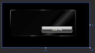
Make sure you save your progress, and click the "[Button]" button on the breadcrumb bar to go back out to our main design area. That's the button finished, so run your application and try it out. The final design area should look something like this:

You can download a project containing the above resources here.
In the next post we are going to
Very nice!
ReplyDeleteHere are a couple things that you may wish to think about.
In my old 3D program when we wanted to fake reflection we always added some highlight, that is a very bright spot(s) that where in the shape of something recognizable like the light though a window or spot lights. Glass is very relective, the highlights on the stroke indicate a light source but it is missing in the glass pain itself.
The light on the button is coming from directly overhead, that dosen't match the glass(top isn't all bright)
Please understand, I like what you have done!
Thanks for the feedback - you are right about the different light sources. I may have to revisit the glass later, although it is really just a background to place the other controls.
ReplyDeleteI want to keep the styles simple enough that they scale nicely and adding highlights is difficult to do without having a particular target size in mind. Those chrome gradients are going to be used again for things like scroll bars etc.
But I'll keep the light source in mind as I build up the other controls.