This post is about the TabControl. The TabControl is a control I have not been looking forward to writing about. Not because it's boring, but because it is tedious to style unless you only ever want your tabs on one side. The TabControl's control template is really 4 different templates rolled into one; one template for each edge of the TabControl. You use the TabControl.TabStripPlacement property to position the tabs on any of the four sides. Actually it's five control templates if you include the control template for the TabItem (which you should).
Here is a the Chrome and Glass styling of the control:
I've only styled two of the four placement options: the top or the bottom. This isn't laziness - it's a valid design decision (truly!). I just don't think tabs sticking out of the side works for the glass and chrome look. When the tabs are on the side they take up far too much horizontal space, and they just don't fit the concept of the theme.
Left-overs from ItemsControl
The TabControl inherits from ItemsControl, which means that it has the "Generated Items (ItemTemplate)" data template, and the "Layout of Items (ItemsPanel)" control template. Neither of these are actually used! You can create custom templates for them if you like, but they are completely ignored by the TabControl. The TabControl handles the collection of items itself and shows only one at a time, using the relevant control template part. The ItemsSource property is another property that you will probably not use unless you are going to manage a collection of TabItems yourself.
The TabControl Control Template
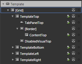 This is the control template for the TabControl. There is a grid for each configuration of the TabControl. The "TemplateTop" grid is made visible when the TabStripPlacement is set to "Top". You can probably figure out the other three...
All four templates follow the same theme: position a TabPanel (just a strip of tabs) and a ContentPresenter. The actual content of the tab pages is kept in the inherited Items property, managed by the TabControl. As a tab from the TabPanel is clicked, the TabControl loads the associated item into the ContentPresenter of whatever grid is being used based on the TabStripPlacement property. Unlike the ListBox, which also inherits from the ItemsControl, the TabControl isn't designed to use a single DataTemplate to show each item it manages. It is designed to have it's tabs and individual item templates created at design time.
I've changed the control template for the TabControl around a little bit (for both the "TemplateTop" and "TemplateBottom" parts). I had to do this because I wanted the selected tab to look like it was the same "piece" as the content area. The default template had the border around the content so there was a line separating the tab from the content. Taking the "TemplateTop" as an example, I've grouped the "TabPanelTop" element into a grid with three columns. The TabPanelTop is in the middle column, and the two side columns have Border controls configured to show lines joining the bottom of the outside tabs to the border around the page content.
The TabItem Control Template
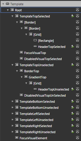 The TabItem template (shown on the right) is the more complex one, and the more tedious one. It contains the template that determines how the actual tab looks (the bit that sticks out). It contains two templates for each position the tabs can be located: one for when the tab is selected, and one for when the tab is unselected. That's a total of 8 templates to style! (unless of course you make the brilliant design decision that you only want one or two positions to be used in your style).
The changes I've made to the TabItem template are to reduce the number of Border controls and to get rid of the gradients and solid fills for the remaining elements. The only background fill is used for the unselected tabs.
The other changes I made were to the states; instead of graying out the whole control I've made them partially transparent. This follows the pattern I've been using for similar controls already completed in the theme.
The TabItem Control Template
One last thing about the TabControl is that it is a pain to style in Blend because the compiled code for the control interferes with normal Blend behavior. For example, if you are editing the TabItem template and use the eye icon in the Object tree to hide or show an element, Blend doesn't always restore the view of the item. The same can happen if you change Visibility between Visible and Collapsed. To make things appear properly again you have to exit out of editing the template, then go back in.
So grab the solution and have a play! Leave a comment if you like it (or if you hate it - or anything in between).
Just wanted to say very nice work thank you for sharing :)
ReplyDeleteWhat FaRess said
ReplyDeleteThat goes double for me!
Thanks for the feedback guys. Glad you find it useful.
ReplyDeletePhil, Nice post mate, i am a big glass fan, but a first time chrome user, while i have glassed and themed Firefox in the pass, i am not sure where the files supplied by you should be added.
ReplyDeleteAsk me anything about FF and i can tell you, so your help here would be much appreciated.
Tell you the truth, it looks slightly similar but when i add files nothing changes.
cheers
xxrazor
Hi xxrazor, thanks for the comments. The "Chrome and Glass" theme refers to the graphical styling, not the "Chrome" layer of the Firefox browser. The project is for a Silverlight application and is for compiling in either Visual Studio or Expression Blend.
ReplyDeleteThanks Phil, sorry for the confusion, i thought it was a glass theme for a Chrome Browser.
ReplyDeleteLooks sweet though, keep up the good work
cheers
xxrazor