In this post we are going to define some gradients and color resources for a glass style that can be applied to a Border control. Here is what the finished button will look like:

We are going to end up with a resource dictionary that we can use with both the ImplicitStyleManager from the Silverlight Toolkit for Silverlight 3, or directly with Silverlight 4. The only difference between the two approaches is that we don't need to add the x:Key="StyleKeyName" attribute on each style, or set the Style property on each control if we want to use it in Silverlight 4.
Setting up our Theme
First we need to create our solution. Start Blend and create a new project (call it something like "ChromeAndGlassTheme". Under the Project menu select "Add new item...", and add a new Resource Dictionary called "ChromeGlass.xaml".
Styling From the Top
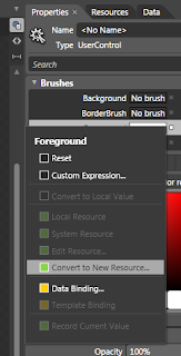
The first thing we want to define is the foreground color for text on most of the controls styles we will end up with - which will be white. So select the "[User Control]" root in the Objects tree, and change the foreground to white. We want this setting to be part of the resource dictionary we created, so we do the following to achieve that:
- Click the "Advanced Property Options" button (the little square button to the right of the Foreground box)
- Select "Convert to New Resource..."
- Give it the name (key) "WhiteForeground"
- Choose "Resource Dictionary" for the location to define it
- Click OK
Since we only have the one Resource Dictionary, it will have created the entry in the ChromeGlass.xaml.
Next, with the "[User Control]" still selected, open the "Object" menu and select the "Edit Style | Create Empty..." menus. Call the style "UserControlChromeStyle", make sure it is created in our ChromeGlass resource dictionary, and click OK. We are now editing the style resource, not the control. On the properties tab click the Advanced Property Options button for the foreground and select the "Local Resource" sub menu, and choose our "WhiteForeground" resource.
Why have we set this on the UserControl? So that we don't need to explicitly set the foreground color for our child controls (such as labels and buttons); Silverlight will search up to see if any of the parent controls have their foregrounds explicitly set before going back to the default value for the control. So since we have set the style of the UserControl to have it's foreground white, all child controls that we place inside it will use WhiteForeground unless we set them otherwise.
Now select the "LayoutRoot" grid and set it's background to black. We could have created a style like we did for the UserControl, but background is not one of the values that is propagated to child controls - and we won't want it passed down anyway.
The Gradients
Our chrome and glass styles are going to rely heavily on a couple of gradient brush resources we are going to define. First lets create the glass panel that can contain our controls. Create a new Border element and make it about 300px wide and about 120px high. Before we create a style for it, we should clear any changes that Blend has already made to the Border's properties. Click the Advanced Property Options box to the right of the Background property and select "Reset". Do this also for the BorderBrush, BorderThickness, and CorderRadius properties.
Now create a new empty style for it like we did for the UserControl - call it "BorderGlassStyle" and be sure to create it in our resource dictionary.
Select the "BorderBrush" property and select the Gradient Brush option below it. The gradient bar will have two markers - one at each end. Select the left marker and change it's color to White (both markers should now be white). Add another 7 markers by clicking on the gradient bar between the existing markers and set the following values for each marker (1 is leftmost, 9 is rightmost. The "Alpha" refers to the "A" part of the color):
- position: 0%. Alpha: 60%
- position: 8.5%. Alpha: 0%
- position: 37.6. Alpha: 20%
- position 41.8%. Alpha: 60%
- position 47.7%. Alpha: 20%
- position 60.5%. Alpha: 0%
- position 76.5%. Alpha: 20%
- position 80.7%. Alpha: 50%
- position 100%. Alpha: 5%
If you click the down-pointing arrow below the gradient bar you will see some other values we can set for this gradient. Set the the start and end points as follows:
- Start Point: 0.013, 0.036
- End Point: 1, 1.005
And set the Border Thickness to 2 for each edge and a Corner Radius of 8. This will make our border look like it is reflecting shafts of light.
We are going to reuse this glassy border brush again, so click the Advanced Property Options button for the BorderBrush property and convert it to a new resource called "GlassBorder".
Since we are editing the style resource, not the Border control itself, lets pop back out to the border to see what it looks like. You can do that by clicking on the "[Border]" part of the Style path at the top of the editing window:

Now we are back in our MainPage file with the Border control selected. Click the little Pac-Man (ok - it's an artist's pallet) shape to go back to editing the style. Now let's create a glassy border for the background.
Select the Background property of the style and again select the Linear Gradient option. We want a total of 5 markers on this gradient. This time we will set the hex values for each of the markers as follows:
- #26FFFFFF position: 0%
- #194C4C4C position: 40.4%
- #19FFFFFF position: 61.4%
- #4DFFFFFF position: 71.5%
- #18FFFFFF position: 100%
Also set the start and end points to the following:
- Start point: 0.388, -0.015
- End point: 0.769, 0.922
You can jump back out of the style now and see what the finished style looks like:

You can download a project containing the above resources here.
In the next post we will create the chrome gradients we are going to need for our controls and create our first control style for the Button control.
This is great. Thank you!
ReplyDeleteThanks! Glad you like it.
ReplyDeleteDude,
ReplyDeleteYou totally rock... Yeah...
Very cool! Even a developer can pick up some style here :)
ReplyDeleteThanks, I'm ramping up and your tutorials are great!!!
ReplyDelete