Showing posts with label Vector. Show all posts

Sunday, March 14, 2010

A Scalable Orb Panel-Button-Thingy

I think I may have mentioned before that I'm not much of an artist - thankfully the internet is chock-full of inspirational ideas. When browsing around some Photoshop tutorial sites, I came across an avatar of enzudesign on a forum; the avatar looks like this.

That's a cool looking button. So credit where credit's due - enzudesign is a talented artist. I wanted to try create something similar in Silverlight that would work as a button, following the same kind of process that I used for the Radio Button I did recently. This one has a LOT more content to it. My first attempt at it required 14 ellipses; 11 of those requiring a blur effect. It also meant containing those ellipses in about 18 proportional columns and rows. It looked nice, but performed poorly. I suspect all those blurs were chewing through a lot of CPU. I don't know how much CPU effort it takes to update those proportional values into real values when the whole thing is animating, but I'm guessing it contributed to the poor performance. This is what it looked like with and without the blur effects:


The blur gives the chrome surrounding ring a rounder appearance, and makes the black look more "rubbery". In comparison, the image without the blur looks stark. I guess this is quite subjective, but to my eyes, the blurred button looks nicer. But it's performance is terrible. I turned it into a button template and the transitions from Normal to MouseOver were not smooth at all. I've included a (collapsed) copy of the above design in the download. So it looked great but it had to lose some detail.

The result, after trimming it down, is embedded below, but I wanted to do more with it than just use it as a button. It occurred to me that this design would make a nice border for a panel; cut it into quarters and you have the corners. All it would need is filling in some horizontal and vertical banding to join the corners. "All it would need" actually turned out to be somewhat fiddly, but before I bore you with the details, the effect I was after needed to have two features:
  1. The button itself would scale nicely, keeping proportion where it needed to
  2. The transition from round orb to rounded panel should be as seamless as possible.
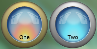
Here is what the "finished" product looks like (download link at the bottom of the post):


The button now consists of only 10 ellipses; 4 of those with blur effects. I won't go through the whole process of compositing the button since that was covered here. But I will quickly cover the process I used of turning an ellipse into a rounded panel.

Setting up the Panel Grid and Corners

I wanted a panel where the corners stay the same and, as the panel grows or shrinks, the "filler" between the corners would expand or contract to fill the gap. The first thing to do was to work out how to get just the appropriate part of each corner to show. I played around with a few options such as using a clipping path, an opacity mask, or using the Path | Subtract tool to convert the ellipses into just the quarter that was needed. These approaches all had their own problems: I don't like clipping paths because they are high-maintenance to animate in storyboards; the Opacity Mask has similar problems since it essentially just a brush that covers the whole object; using the Path | Subtract tool gave the right shape, but the blur effects and the gradients were now applied to just that quarter and proved too fiddly to work with. This was compounded by the fact that the button is not symmetrical across all four quarters.

In the end I discovered that if I confined the whole thing into a grid cell, but sized it so that it was twice as wide and twice as high as the cell, then the Grid automatically clipped out everything except the bit that fitted in the cell. So the here is what the containing grid looks like with the four corners in place:


The first and last columns, and the first and last rows, are each set to a fixed width/height (in this case 50 pixels). The middle columns and rows have their width/height set to "1*" to take up all the gap between the fixed rows and columns. Each corner has an entire copy of the "button" shapes sized to 100x100 pixels, and has it's horizontal/vertical alignment set to the appropriate values for each corner.

Although this provides the corners that I need, I'm not entirely happy with this approach because I can't easily animate the column width and height of the corner cells if I want the radius of the corners to change. In the embedded Silverlight app above, it is the button itself that is changing radius - not the panel grid. I would like to come back and address this at a later date to work out how to achieve this more easily. I have in mind that creating a custom control with template parts for the corners and horizontal fills would work - I'll have to experiment when I get the time.

The Fillers

The next stage was to create the fills between the corners and in the middle. For the top and bottom fills, this was achieved by copying the whole button structure, changing the ellipses into rectangles, and removing the columns from the containing grid to make the shapes span the whole grid. I had to change into the XAML view to change the ellipse tags to rectangle tags.

The resulting grid is sized the same as the corner shapes (100 pixels high) and restricted to the middle top grid cell to clip out the bottom half.

The same result is copied and pasted for the bottom fill and placed in the middle bottom cell.

The vertical fills are done essentially the same except there were a couple of areas that were a bit trickier because the button is asymmetrical vertically. I was able to remove a few of the shapes for the vertical fill because it's mostly just black between the chrome ring and the blue orb center. The trickiest part was the center blue part of the orb. The bit that goes from the the left side of the blue center to the right side of the blue center. For the other rectangles I just tweaked the existing gradients, but for the center rectangle I created the gradient from scratch using the color picker tool to get a selection of colors across the width of it.

The last part of the grid was straight forward, it is just a rectangle with a solid color fill. It stretches horizontally and vertically to fill the middle space.

The only other thing to point out is that I had to set the margins of the horizontal and vertical fill edges that met the corners to -3 so that there was no obvious seam. If you look hard you can still make out where the parts meet, but I don't think you would notice them unless you were specifically looking for them.

The Animation

The animation is somewhat of a cheat. It looks like the button shrinks, and then expands into a panel containing the buttons. There is actually two groups of controls here: the button is shrinking down in size, but then it's opacity animates to 0 to reveal the panel behind it (in exactly the same location). It is then the panel that grows to reveal the fillers, and then displays the buttons inside it. The whole process is reversed when the panel is closed.

I really like the end result, but I would like to come back and revisit this later to make the whole thing easier to replicate with a different design.

Download, including source, from here.

Friday, February 26, 2010

A Scalable Orb Radio Button

I saw this great looking glassy "uber" orb on the Expression Gallery page a while ago and got inspired to have a go creating something similar.

I had a search around for a Photoshop tutorial for something along the same lines and found this one.

The end result can be found (and downloaded) here, and looks like this:


The one thing I didn't like about the orb button on expression gallery was that it was not scalable. Trying to resize it to make a normal size radio button just didn't work.

So my first goal was simply to try and reproduce the look of the button from the Photoshop tutorial.

I was able to pretty much follow the Photoshop tutorial instructions, but the main difference was when the tutorial said to feather a selection, I just used the Blur effect in Blend.

The interesting part came when it got to step 7/8 in the tutorial. To get the reflection effect, I downloaded and compiled the WPF Pixel Shader Effect Library from Codedplex. The compiled assembly is included in the sample download from the Microsoft Expression Gallery.

It's hardly worth a step by step description of how to make this button since the Photoshop tutorial can be referenced for the general approach. However, there were a couple of interesting techniques that I will cover here in order to make this behave nicely as a scalable button.

Blur is Your Friend

Sometimes it can just be painful getting a gradient brush to do exactly what you want it to do. Trying to get a nice graduated fade into the background using a gradient brush seems to have mixed results depending on which colours I'm using. The blur does a great job here however. Applying a blur with a radius of 10 smooths the front ellipse into the background ellipse, and only requires a solid brush for the fill instead of trying to tweak a radial gradient brush.

This also comes in handy when you already have a gradient fill that you want to apply, as shown in the second image. The top ellipse has a linear gradient brush and the blend smooths it into the background quite nicely.

This will scale nicely too, providing a fixed blend area as the button grows or shrinks. This may sound like it is going against the principle of having proportional scaling, but I prefer this particular part of it not to scale proportionally - I want the same appearance of a thin curved surface at the edge regardless of the size of the button.

Getting it to Scale Nicely

As mentioned above, the "uber" orb button that got me interested in the first place, didn't scale well. It was initially constructed in a Canvas container so resizing didn't do anything. Changing it's container to a Grid allowed me to resize, but the resize didn't make the contents scale nicely.

None of this is a reflection on the designer (Thebirdbath) - since the goal of having it scale nicely was mine, not the designers.

So the trick to having it scale nicely is to use a grid with lots of columns and rows specified in star (*) widths, which are proportional. The way I did this was to:
  1. Build the button at a fixed size inside a grid with horizontal and vertical alignment set to stretch and using margins to position everything
  2. Calculate the offsets for each object inside the grid
  3. Turn those offsets into proportional columns and rows.
  4. Position each object in the appropriate column and row, with the appropriate column and row spans - and remove the margins
Sometimes when drawing a shape, Blend will set one of the alignments to something other than stretch. Trying to set the alignment on the properties sheet will usually change the position or size of the shape. The easiest way to convert the alignment is to use the little link icons that appear between a shape and the grid edges when you select the shape.

The measurement and conversion is not difficult, just tedious, So, for example, the second ellipse is 3 pixels in from all edges, and the whole button is 172 pixels wide and high, as I have created it initially. 3 pixels is 1.74% of 172 which converts into a column of width="0.0174*".

The next shape has a margin of 6 pixels all sides, but since we already have a column spanning the equivalent of 3 pixels we only need to make the second column 3 pixels also. The way I actually calculated this was to write all the margins down on the piece of paper, going in from both sides (doing columns first) and letting the middle remaining column take up the slack. I then calculated the pixels differences between the margins and converted them to a percentage for the column width. Rinse and repeat for the rows. Boring, but it does the job.

The columns were especially important for the "reflection" in the button.

The Reflection

The reflection was tricky. I toyed with the idea of just creating the deformed rectangular shapes by hand as paths, but I didn't think I would be able to achieve such a natural look (I'm not much of an artist). That's when I remembered the WPF Pixel Shader Effect Library on Codeplex. It has a SmoothMagnifyEffect that worked nicely. I combined the eight rectangles into a combined path and applied the effect, fiddling with the settings until I was happy with it. However it didn't seem to scale nicely at first, even though it was in the grid. As I scaled the button the changing size of the path would cause the effect to make it go completely out of shape. In the end, I put the path inside another grid along with a transparent ellipse. The path was positioned using rows and columns and the ellipse was allowed to fill the whole grid, which was the same size as the parent grid. This allowed the SmoothMagnifyEffect to be applied to the whole button size, affecting the window shape path roughly the same way at different sizes.

The Result

So with all the bits and pieces positioned in the grid, I end up with a button that scales well.

Blend makes it ulta simple to turn my grid with shapes into a button. The technique is covered on many other web sites, but it's as easy as right clicking the container (probably easiest in the object tree), selecting "Make into Control", and selecting Radio Button from the list of controls.

The Uber Button was a normal button, but I've always considered round buttons like this to work better as a Radio Button.

So the only thing left to do is to create the changes for the various states such as MouseOver and Checked etc.


A couple of things to remember when recording states:
  • Don't change the property of an object in two states from different state groups. With a Button this is usually not an issue, but with a Radio Button you have the CommonStates AND the CheckedStates. I had to duplicate an object that I wanted to appear differently in those two state groups.
  • Changing the easing function from the default can make a difference. I didn't do that in this example, but have done many other times - it can make a simple animation look natural and sophisticated.
Feel free to grab the radio button and use it for your own projects. It would be nice if you left me a comment below to let me know if you find it useful.

And remember that you can put whatever content you like inside the button! It doesn't have to be simple text - in fact if I was a better artist I would have made some nice icons to go inside them.