Showing posts with label Blend. Show all posts

Wednesday, February 2, 2011

Designing for Browser-Zoom: Part 2

[UPDATED: Fixed broken links for download]

The ability to adjust the magnification level in your browser (using zoom + or -) has the potential to ruin your carefully crafted UI design. In Part 1 we took a look at the mechanisms involved in browser zoom and the effect it can have on your Silverlight app (particularly the EnableAutoZoom setting).

In this part we are going to handle browser zoom with visual states and use an attached behaviour that allows us to integrate zoom management into our views and control templates from Blend, without having to write any code.

A Demonstration

Here is the sample application we will be working with. This is just a mock layout of a simple utility app – it is contrived for the purposes of showing how scaling can affect your design:

to launch this in a separate window and use the the browser’s zooming feature to zoom in to 150%, 200%, then back to 100%. This demonstrates the desired behaviour. You will see the spacing content change at each of those zoom levels – and at 200% the images are no longer visible. There is a link for the source code at the end of the article.

If this app is zoomed into 200% within the same available space, without adjusting the design for the zoom level, then the result is the undesired behaviour which looks like this:

ZoomWithoutResizerCapture200

As you can see, the title bar now takes up half the available height, a complete row of buttons is missing, and the button captions are cut off. Remember, if the user has their DPI settings set to show large text this could already be happening to your existing Silverlight apps!

Using Visual States for Zoom Levels

I’m going to make an assumption here for the sake of demonstration. I’m going to assume that some user research was carried out and showed that people were zooming in (or it was happening automatically based on the host computer’s DPI setting) because they liked large text – the images are not important to them.

Given this assumption, I need to be able to adjust the layout for different zoom levels, giving priority to the text in the application (headings, button captions etc). Visual States are ideal for showing the same information in a different way. I’ll use Blend to show how I have set up the visual states here:

ZoomStates

The image above shows the VisualStateGroup “ZoomStates” with three VisualStates in the group: Unzoomed, Zoomed150, and Zoomed200. In each of these states I have adjusted the spacing available for the header and adjusted the margins around each of the panels (which are HeaderedContentControls).

I have a problem though: I have customized the control templates for the HeaderedContentControl and the Button controls. How do I include changes to the control templates as part of a visual state for the main view? I can’t! I could create 3 different control templates for each control I was customizing, but that would quickly become a maintenance nightmare for a decent sized project.

There is another answer to this problem that I will discuss below, but for now we have to work out how to switch states as the browser zoom changes.

The Application.Host.Content.Zoomed Event

The Content class in the System.Windows.Interop namespace (part of the Silverlight System.Windows assembly) is described by the documentation as follows:

“Reports details about the Silverlight-based application's instantiation settings, and exposes some of the HTML DOM values for the hosted Silverlight plug-in instance. System.Windows.Interop.Content contains APIs that specifically relate to the Silverlight content area (the area declared by the width and height in the initialization).”

One of its members is the Zoomed event. If the browser starts up and responds to the host system’s DPI settings, or if the user manually zooms, then this event is fired. We can hook into this event in the Loaded event of our main view and respond to changes in the zoom like this:

   1: public partial class MainPage : UserControl
   2: {
   3:     public MainPage()
   4:     {
   5:         // Required to initialize variables
   6:         InitializeComponent();
   7:         Application.Current.Host.Content.Zoomed += this.Content_Zoomed;
   8:     }
   9:  
  10:     private void Content_Zoomed(object sender, EventArgs e)
  11:     {
  12:         var zoom = Application.Current.Host.Content.ZoomFactor;
  13:         if (zoom <= 1)
  14:         {
  15:             VisualStateManager.GoToState(this, "Unzoomed", true);
  16:         }
  17:         else if (zoom <= 1.5)
  18:         {
  19:             VisualStateManager.GoToState(this, "Zoomed150", true);
  20:         }
  21:         else if (zoom <= 2)
  22:         {
  23:             VisualStateManager.GoToState(this, "Zoomed200", true);
  24:         }
  25:     }
  26: }


The above code hooks into the Zoomed event and, when it fires, checks what the current ZoomFactor is. It then uses that value to determine which visual state it should transition to.


Now we have a mechanism to adjust our design to the current zoom level, but we still have a few problems:


  1. We still can’t reach into control templates to adjust margins and content

  2. We have to re-write this code (paying careful attention to state names) for every view we create

  3. We have to write code! Not very friendly for dedicated designers who are working with Blend


Behavioural Zoom Management


An attached behaviour could help us solve all three of these problems. Let's look at each problem in reverse order:


Unfriendly to a designer: An attached behaviour is drag-n-drop easy and we can use a Blend SDK attribute to help us pick the state to transition to.


Re-writing code: An attached behaviour encapsulates the code and lets us reuse it with ease.


Reaching into the control template: Hmmm, this one is a little more interesting. A control template already comes with pre-defined states (some controls have none) and using VisualStateManager.GoToState does not work for any additional states you add by hand (our ZoomedStates group). So if we customize a control template and add our new zoom states to it, can we find a way to transition to those states? As it turns out, there is a way: A visual state is a wrapper around a storyboard – so we could write our attached behaviour to locate the appropriate state, reach inside it for the storyboard, and just play the storyboard. This actually works, but there is a caveat that I will discuss below.


You can download the code for the ZoomResponder attached behaviour here. Without giving a full listing, I’ll go over the main parts of the code.


First up, here are the dependency properties for the attached behaviour:


   1: public static readonly DependencyProperty ZoomRangeStartProperty = DependencyProperty.Register(
   2:     "ZoomRangeStart", typeof(double), typeof(BrowserZoomStateBehavior), null);
   3:  
   4: public static readonly DependencyProperty ZoomRangeEndProperty = DependencyProperty.Register(
   5:     "ZoomRangeEnd", typeof(double), typeof(BrowserZoomStateBehavior), null);
   6:  
   7: public static readonly DependencyProperty StateNameProperty = DependencyProperty.Register(
   8:     "StateName", typeof(string), typeof(BrowserZoomStateBehavior), null);


Each dependency property also has a public class property with a getter and a setter.


This attached behaviour is responsible for one zoom state (“StateName”). To respond to the 150% and 200% zoom levels we need 3 of these attached behaviours (the third one is to transition back to the unzoomed state). The “ZoomRangeStart” is inclusive and the “ZoomRangeEnd” is exclusive. Therefore, the behaviour for switching to the 150% will have ZoomRangeStart = 1.5 and ZoomRangeEnd = 2 since there will be a different instance of the behaviour responsible for switching to 200%.


The public class property for the StateName property is decorated with the CustomPropertyValueEditor attribute from the System.Windows.Interactivity namespace:


   1:  
   2: [CustomPropertyValueEditor(CustomPropertyValueEditor.StateName)]
   3: public string StateName
   4: {
   5:     get
   6:     {
   7:         return (string)this.GetValue(StateNameProperty);
   8:     }
   9:     set
  10:     {
  11:         this.SetValue(StateNameProperty, value);
  12:     }
  13: }


That attribute lets Blend know that the property is the name of an existing state in the XAML. It changes the property editor for the the StateName property from a text box to a drop down combo box that lists the available states that have been defined. Handy!


So the view will have three of these templates attached to its root:AttachedZoomResponderBehaviors


Here is the main code that handles the state change:


   1: private void UpdateZoomedState()
   2: {
   3:     var zoomed = Application.Current.Host.Content.ZoomFactor;
   4:     if (zoomed >= this.ZoomRangeStart && zoomed < this.ZoomRangeEnd)
   5:     {
   6:         if (!VisualStateManager.GoToState(
   7:             this.AssociatedObject, 
   8:             this.StateName,
   9:             true))
  10:         {
  11:             if (null == this.AssociatedObject.Parent &&
  12:                 VisualTreeHelper.GetParent(this.AssociatedObject) is Control)
  13:             {
  14:                 // play the storyboard - we are probably inside a control template
  15:                 var stateGroups = VisualStateManager.GetVisualStateGroups(
  16:                     this.AssociatedObject);
  17:                 foreach (VisualStateGroup stateGroup in stateGroups)
  18:                 {
  19:                     foreach (VisualState visualState in stateGroup.States)
  20:                     {
  21:                         if (null != visualState.Storyboard &&
  22:                             visualState.Name.Equals(this.StateName))
  23:                         {
  24:                             visualState.Storyboard.Begin();
  25:                             return;
  26:                         }
  27:                     }
  28:                 }
  29:             }
  30:         }
  31:     }
  32: }


The behaviour first tries to use the VisualStateManager to transition to the associated state. If the result of the call to VisualStateManager.GoToState is false then we know the call failed, possibly because the associated object is inside a control template (as discussed above). The code checks to see if the logical parent of the associated object is null and if the visual parent of the associated object is a control. If both of these conditions are true then we will assume we are attached to a control template and try to find a matching state associated with it. If we find one, we grab its storyboard and play it.


Caveats


There is one thing to be aware of when using this inside a control template. Do not use storyboards with “From” values in the key frames, otherwise you will end up with bizarre animations playing when they should not. For example, if you had the visual state for “Unzoomed” specify a “From” value for a key frame, you would end up playing that storyboard regardless of the zoom factor the browser was last set at, including values that fall between the different states (e.g. 125%).


Summary


In these two posts I have shown how the browser zoom can play a big part in how your design appears to the end user. Introducing visual states to accommodate different zoom levels is one way to handle it. An attached behaviour that wraps up the management of switching states in response to the zoom event provides an elegant response to this issue that designers can use.


You can grab the code here.

Tuesday, February 1, 2011

Designing for Browser-Zoom: Part 1

Zooming is good for you

The ability to zoom your web browser content is often over-looked when designing either traditional or Silverlight web applications - but it can also be a feature, rather than a problem. Silverlight’s native ability to respond to the browser-zoom provides the potential to really enhance your user’s experience of the application.

I was recently giving a demo of a Silverlight mock-up (with Sketch Flow) and one of the clients complained that he liked to increase the DPI setting on his computer because he had difficulty reading standard sized text. I showed him, on the demo computer, how he could zoom the content in the browser (in IE it’s Ctrl + and Ctrl – to zoom in and out) and the Silverlight app scaled along with it. Thankfully, the mock-ups happened to scale nicely and everything still fit snuggly in the available screen-space.

But it got me thinking about how to respond better to the browser content zooming in and out. I happen to manage the UX side of my current employer’s software development and it occurred to me that if a Silverlight application didn’t respond well to the zoom setting, it could completely ruin the user’s experience of that Silverlight Application.

So this will be a two-part series on how the user experience of your Silverlight application can be enhanced by accounting for the browser zoom feature:

  1. The first part (this part) will cover the zoom mechanism and the different pieces that are involved.
  2. In the second part I will show you how to adjust your design with a little bit of code and some visual states.I will also present an attached behaviour you can use in Blend to respond to the zoom event without having to write code.

How zooming works

There are four things you should know about the zooming feature of a browser and it’s interaction with Silverlight:

1. EnableAutoZoom

All the big-name browsers support zooming the page content. Internet Explorer (possibly others too) also respects the DPI settings on the host computer and automatically zooms the browser content to match it. In Windows 7, one way to change this DPI value is through the Control Panel –> Display settings page:

adjustscreendpiIf these settings are changed then, by default, when IE starts it will scale your whole web page, including your Silverlight application, automatically to reflect these DPI settings. The effect is the same as if you had scaled the whole page manually. The Internet Explorer team call this Adaptive Zooming.

If your Silverlight application takes up the whole page, or is part of a page design that uses the remaining space that other scalable elements don’t need, then this may cause problems for your layout. You may end up with headers or footers that unnecessarily take up way too much room and leave too little room for grids and lists of details.

At the very least, you should know how to disable this automatic behaviour if you don’t plan on accommodating it; you can control this behavior with the Silverlight object embed “EnableAutoZoom” setting which looks like this:

<object ...>
<param name="enableautozoom" value="bool"/>
...
</object>


To turn it off, set it to “False”. But I would recommend, instead of turning it off, that you use it to your advantage and keep your application usable at different zoom levels.


2. OnZoom

If you are writing JavaScript for your page for custom layout effects etc, then you can add a handler for the zoom event by attaching it to the OnZoom event on the Silverlight object. I only mention this in passing for the sake of completeness since I am focusing here on the Silverlight side of things. For more information on this event, you should read about the Html Bridge between managed and unmanaged code.


3. Content.Zoomed

You can respond to zoom events in managed code, inside your Silverlight app, by attaching a handler to the Content.Zoomed event like this:


Application.Current.Host.Content.Zoomed += new EventHandler(this.ContentZoomed);

This event will fire when the user manually zooms the page (e.g. Ctrl + and Ctrl - in IE) and will also fire when the application first loads (for IE at least) if the DPI settings for the computer have been changed from the standard setting.


The event handler takes the standard sender object and a basic EventArgs that contains no useful information. So how do we know what the current zoom settings is? With the Content.ZoomFactor property.


4. Content.ZoomFactor

The Content.ZoomFactor gives the current zoom ratio for the whole page including your Silverlight Application. A value of 1 means 100%, 1.5 means 150% etc.


What to do about zoom?


So how do we take advantage of this built in ability to scale the whole application? How do we accommodate the users who like having their DPI settings increased? We need to think carefully about how our screen layouts and designs would look when scaled to different zoom levels.


Just as an experiment, between now and the next post, fire up one of your full screen Silverlight apps, resize the browser to the smallest size where everything still fits nicely, and then zoom in to 150%, or even 200%. How does it look?


In the next post I’ll discuss a way that we can design for this feature and still have our screens look beautiful.

Tuesday, November 30, 2010

Two-Way Binding on TreeView.SelectedItem

In this post I’m going to describe an attached-behavior for a TreeView control that allows you to achieve two-way binding on the SelectedItem property. You can grab the source code here.

[UPDATE 6 Dec 2010]: I fixed a bug that was causing it to fail to update the TreeView when the selected node was set (through binding) before the view had loaded.

Background

If you have ever tried using the TreeView control with it’s ItemsSource bound to some kind of data context then you probably know how frustrating it can be to work with the SelectedItem property. This is especially true if you are trying to follow an MVVM pattern.

Typically when you use an ItemsControl you want to create a two-way binding on two of its properties: ItemsSource and SelectedItem. But TreeView, unlike other ItemsControl subclasses, has a read-only SelectedItem property which means no two-way binding like this:

<sdk:TreeView 
ItemsSource="{Binding TreeNodes}"
SelectedItem="{Binding SelectedNode, Mode=TwoWay}"/>


There are a number of workarounds for this challenge (and it is a challenge – just try a Google search for Silverlight TreeView SelectedItem) but most of the solutions I’ve read either seem too complex to use, require you to compromise the MVVM pattern, or are unfriendly with Blend. Wouldn’t it be nice if you could just attach a behavior to the TreeView to make it work?


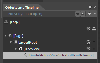
BindableTreeViewSelectedItemBehavior


Yeah – it’s a long name for a behavior, but at least you know what it does just by reading its name. Using it in Blend is pretty easy:


Using the Behavior in Blend


Just drop it on the TreeView control and set its Binding property.The XAML binding will look like this:


<sdk:TreeView ItemsSource="{Binding TreeNodes}" ...>
<i:Interaction.Behaviors>
<Behaviors:BindableTreeViewSelectedItemBehavior
Binding="{Binding SelectedNode}"/>
</i:Interaction.Behaviors>
</sdk:TreeView>


You don’t need to make it a two-way binding, the behavior looks after that for you. Here is a sample application that has two TreeView controls bound to the same data context. If you change the selected item on one TreeView it will update the selected item on the other TreeView:


Under The Hood


This attached behavior works by acting as a go-between using the TreeView.SelectedItemChanged event, the TreeView.SelectedItem property, and a private two-way binding on the data context. Here is a diagram that shows how the behavior wires itself up:


Diagram of relationships for behavior


Click on the diagram to see a larger version. The diagram can be broken down as follows:


  • The behavior examines it’s Binding property and uses that information to create a private two-way binding between the property on the data context of the tree view (in our example it’s against the SelectedNode property) and the behavior’s private SelectedItemProperty DependencyProperty.
  • When the value for the DataContext’s SelectedNode property changes, the change event for the SelectedItemProperty DependencyProperty (AssociatedObjectSelectedItemChanged) fires and we set the new value on the TreeView using the TreeView.SelectedItem property. This allows the tree view to have its selected item set from the data context.
  • The behavior also attaches an event handler for the TreeView.SelectedItemChanged event (also called SelectedItemChanged) which fires whenever the user changes the selected item.
  • When the SelectedItemChanged event handler is called, the behavior updates the value of its SelectedItemProperty DependencyProperty. This allows the data context to have its SelectedNode value updated when the user changes the selected item in the TreeView.

Summary


In this post I described an attached behavior that lets you achieve two-way binding on the TreeView.SelectedItem property. The behavior is especially useful if you are using the MVVM pattern to keep your views and view models separate, and want to avoid code in the View’s code-behind file. The source can be downloaded here.

Tuesday, November 23, 2010

A Behavior for Remembering Settings

I have been unusually busy for the last couple of months and have been neglecting my blog. Things are still pretty busy, but I hope to squeeze out a few posts if I can.

In this post I’m going to describe a behavior that you can attach to your controls and bind to a property on that control. The behavior will monitor the value of that property and store any changes to it in Isolated Storage. The next time you start the application the behavior will look in Isolated Storage and load the value if it can find it, then restore the value to the control. This is a handy behavior for things like grid splitters, sliders, or similar types of controls (dial’s too!) where you want any changes the user makes to be remembered the next time they run your app.

Demo Application

You can grab the behavior here. And this is the behavior in action:

If you refresh this page, the application will remember the opacity value for the border control, the position of the grid splitter, and the selected index of the list.

Using the behavior looks like this:

   1: <Border x:Name="border">
   2:     <i:Interaction.Behaviors>
   3:         <TotalRecall:TotalRecallBehavior Binding="{Binding Opacity, ElementName=border}"/>
   4:     </i:Interaction.Behaviors>
   5: </Border>

There are two things worth discussing about this behavior; the Binding to a control’s property and the the storing/retrieving using Isolated Storage.


Binding to a Control’s Property


The XAML above shows the TotalRecallBehavior being used to remember the opacity of the border element. Internally, the behavior needs to know when the property being bound to (in this instance it is the Border.Opacity property) changes value so it can store it away for next time. To do this, the behavior has an internal DependencyProperty called BindingValueProperty that it uses to create another two-way binding to the same property on the control. BindingValueProperty has an event handler for when the value changes so it can store the new value in Isolated Storage.


The code that uses the behavior’s Binding property to set up a private two-way binding looks like this:


   1: private void CreateBindings()
   2: {
   3:     var expression = this.ReadLocalValue(BindingProperty) as BindingExpression;
   4:     var watcher = new Binding();
   5:     if (expression.ParentBinding.Source != null)
   6:     {
   7:         watcher.Source = expression.ParentBinding.Source;
   8:     }
   9:     else
  10:     {
  11:         watcher.ElementName = expression.ParentBinding.ElementName;
  12:     }
  13:  
  14:     watcher.Path = new PropertyPath(expression.ParentBinding.Path.Path);
  15:     watcher.Mode = BindingMode.TwoWay;
  16:     BindingOperations.SetBinding(this, BindingValueProperty, watcher);
  17:  
  18:     this.recallValue = new RecallValue(this.AssociatedObject.GetType().Name + "." + 
  19:         AssociatedObject.Name + "." + expression.ParentBinding.Path.Path);
  20: }

The call to “this.ReadLocalValue(BindingProperty) as BindingExpression” is exactly what UIElement.GetBindingExpression() does, but the Behavior is not a UIElement so I just make the same call. Getting hold of the BindingExpression is important since it gives us access to the correct binding source and property path. The BindingExpression only exists on the source object of the binding (even if it is two-way), so on line 2 of the XAML snippet the binding is set on the behavior and must therefore be read from the behavior with the call to ReadLocalValue (line 16 of the C# code above). If you try and read the BindingExpression on the element being bound to you will get null returned.


The behavior sets up the binding and creates an instance of the RecallValue class. I have future plans for the RecallValue class, but for now it is simply a wrapper around a string value.


Using the ApplicationSettings on IsolatedStorage


You can use isolated storage to store all kinds of information on the user’s local machine. You can read all about local storage in Silverlight here. One of the less frequently covered uses of Isolated Storage is the IsolatedStorageSettings.ApplicationSettings static property. This property is an IDictionary and has an indexer you can use to read and write with. These are very handy for storing atomic name-value pairs; exactly the kind of thing I want to do with this behavior.


The code that read’s the value from isolated storage is as follows:


   1: if (IsolatedStorageSettings.ApplicationSettings.Contains(this.recallValue.Key))
   2: {
   3:     this.recallValue.Value = (string)IsolatedStorageSettings.ApplicationSettings[this.recallValue.Key];
   4: }
   5: if (null != this.recallValue.Value)
   6: {
   7:     this.SetValue(BindingValueProperty, this.recallValue.Value);
   8: }

The value is read from isolated storage if it exists, and set as the value for our private BindingValueProperty dependency property, which is by now two-way bound to the control’s property. The IsolatedStorageSettings class takes care of creating a location in isolated storage for the values so there’s no other code needed for setting up file streams and creating directories etc. 

Similarly, the code for writing to the isolated storage settings is as follows:


IsolatedStorageSettings.ApplicationSettings[behavior.recallValue.Key] = behavior.recallValue.Value;


The rest of the behavior is just plumbing.


Future Improvements


As I said earlier, I have plans for the RecallValue class. I want to support the saving/restoring of complex objects and values that don’t parse easily to and from string.


I would also like to improve the design-time experience – the Binding type doesn’t play very nice with Blend’s element binding design tool, so I can’t use the CustomPropertyValueEditor attribute. I would really like the design time property editor for the Binding to list the properties on the attached object the same way the ChangePropertyAction does.


Summary


In this post I’ve described a behavior that remembers the value of a property on the control it is attached to. I described the use of the BindingExpression class to create a private two-way binding, and described how to use the IsolatedStorageSettings.ApplicationSettings dictionary. In the code download there are examples of the behavior being used on different kinds of controls and properties.

Monday, August 23, 2010

Redial – A Dial Custom Control

In the last post I described a Dial User Control and promised I would turn it into a Custom Control. Re-doing it as a viewless custom control means it can be visually redesigned without having to write any behavior code.

Here is the control with a couple of different styles, with some of the dials bound to an items source. I also added an animation for the dial positions being added and removed. You can see this by changing the value of the big dial in the bottom left corner; its value sets the MaxValue of the top left dial.

You can grab the source here.

There are a couple of features in this control that weren’t in the User Control:

  • The ItemsSource property can be bound to a data source for the dial position items. If you use this then don’t use MaxValue since that is automatically determined from the data source.
  • If you don’t use an items source, the positions are auto-generated using the StartValue and MaxValue properties.
  • I added very basic support for the mouse wheel, but it needs improvement.
  • I changed the behavior of the RotationAngle property to take into account any initial rotation of the list box path, and also the span of the path.
  • You can click and drag around the dial positions to set the value

A Simple Style

orientations

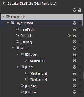
The template to the left shows the entire template for the black speaker-style dials in the top right of the sample application above. This is a good starting point for creating styles for the dial since it is very simple.

There are three key elements to note:

  1. The “itemPath” element is the ellipse that defines where the dial positions end up.
  2. The “DialList” element is the path list box that uses the itemPath. The Dial control won’t work without this. Any style for the Dial control must include a PathListBox control called “DialList”.
  3. The “Knob” grid contains the visual elements that are rotated – more about this below.

The remaining elements are not doing anything interesting other than adding to the visual appearance of the knob.

In order to get the knob to rotate, I have bound it to the RotationAngle property:

   1: <Grid x:Name="knob" Margin="10" RenderTransformOrigin="0.5,0.5">
   2:     <Grid.RenderTransform>
   3:         <CompositeTransform Rotation="{Binding RotationAngle, RelativeSource={RelativeSource TemplatedParent}}"/>
   4:     </Grid.RenderTransform>
   5:  
   6:     ...
   7:  
   8: </Grid>

The RotationAngle property calculates the correct position by looking at the DialList PathListBox, determining the rotation of it, and the span. You may have noticed that I used the “RelativeSource” syntax inside a regular Binding instead of using the TemplateBinding syntax. I did this out of habit, since elsewhere I use property converters on bindings in the other templates, and the TemplateBinding class does not support converters.


Here is an example that uses a converter:


   1: <LinearGradientBrush EndPoint="0.5,1" MappingMode="RelativeToBoundingBox" StartPoint="0.5,0">
   2:     <LinearGradientBrush.RelativeTransform>
   3:         <CompositeTransform CenterY="0.5" CenterX="0.5" 
   4:             Rotation="{Binding RotationAngle, RelativeSource={RelativeSource TemplatedParent}, Converter={StaticResource negativeConverter}}"/>
   5:     </LinearGradientBrush.RelativeTransform>
   6:     <GradientStop Color="Black" Offset="1"/>
   7:     <GradientStop Color="#FF3B3B3B"/>
   8: </LinearGradientBrush>

Feel free to use this control in your own projects.