In the last post I described a Dial User Control and promised I would turn it into a Custom Control. Re-doing it as a viewless custom control means it can be visually redesigned without having to write any behavior code.
Here is the control with a couple of different styles, with some of the dials bound to an items source. I also added an animation for the dial positions being added and removed. You can see this by changing the value of the big dial in the bottom left corner; its value sets the MaxValue of the top left dial.
You can grab the source here.
There are a couple of features in this control that weren’t in the User Control:
- The ItemsSource property can be bound to a data source for the dial position items. If you use this then don’t use MaxValue since that is automatically determined from the data source.
- If you don’t use an items source, the positions are auto-generated using the StartValue and MaxValue properties.
- I added very basic support for the mouse wheel, but it needs improvement.
- I changed the behavior of the RotationAngle property to take into account any initial rotation of the list box path, and also the span of the path.
- You can click and drag around the dial positions to set the value
A Simple Style

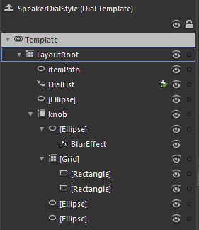
The template to the left shows the entire template for the black speaker-style dials in the top right of the sample application above. This is a good starting point for creating styles for the dial since it is very simple.
There are three key elements to note:
|
The remaining elements are not doing anything interesting other than adding to the visual appearance of the knob.
In order to get the knob to rotate, I have bound it to the RotationAngle property:
1: <Grid x:Name="knob" Margin="10" RenderTransformOrigin="0.5,0.5">
2: <Grid.RenderTransform>
3: <CompositeTransform Rotation="{Binding RotationAngle, RelativeSource={RelativeSource TemplatedParent}}"/>
4: </Grid.RenderTransform>
5: 6: ... 7: 8: </Grid>
The RotationAngle property calculates the correct position by looking at the DialList PathListBox, determining the rotation of it, and the span. You may have noticed that I used the “RelativeSource” syntax inside a regular Binding instead of using the TemplateBinding syntax. I did this out of habit, since elsewhere I use property converters on bindings in the other templates, and the TemplateBinding class does not support converters.
Here is an example that uses a converter:
1: <LinearGradientBrush EndPoint="0.5,1" MappingMode="RelativeToBoundingBox" StartPoint="0.5,0">
2: <LinearGradientBrush.RelativeTransform>
3: <CompositeTransform CenterY="0.5" CenterX="0.5"
4: Rotation="{Binding RotationAngle, RelativeSource={RelativeSource TemplatedParent}, Converter={StaticResource negativeConverter}}"/>
5: </LinearGradientBrush.RelativeTransform>
6: <GradientStop Color="Black" Offset="1"/>
7: <GradientStop Color="#FF3B3B3B"/>
8: </LinearGradientBrush>
Feel free to use this control in your own projects.