Saturday, April 3, 2010

A Chrome and Glass Theme - Part 2

Well - it's a long weekend here in New Zealand due to the Easter holidays, so I have some spare time to do another post in this series earlier than I would otherwise have had.

In the last post we created a resource dictionary and defined some brush and style resources to create a glassy panel. In this post we are going to define some more brush and resource styles for a chrome looking button. Here is what the button will look like:

Open up the solution from the last post - if you haven't been following along so far, you can grab the solution so far here.

Editing the Button Style
Select the Border control and create a button inside it about 140x30 in size. Click the "[Button]" button on the breadcrumb trail bar and edit a copy of the button template. Call the new style "ButtonChromeStyle" and be sure to select the "Resource Dictionary" option to create it in our ChromeGlass resource dictionary.

Blend has created a copy of the default style and control template of the button. But before we change the appearance of the elements inside the control template, click the "artists palette" icon in the breadcrumb trail so that we are editing the style itself, and not the control template inside the style.

We are going to define the chrome-looking border so select the BorderBrush property on the Properties tab. The button already has a linear gradient so add 3 more markers to the three already there and define the locations and colors as follows:
  1. #FFDCDCDC Position 0%
  2. #FF656565 Position 44.8%
  3. #FFD8D8D8 Position 68.9%
  4. #FF2B2B2B Position 92.6%
  5. #FFE9E9E9 Position 94.8%
  6. #FF494949 Position 97.2%
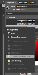
We are going to want to reuse this brush again so click the Advanced Properties Options button on the right of the BorderBrush property and select "Convert to new resource...". Call it "ChromeBorder".

Select the Foreground property on the style and change it to white - for some reason, the Button control doesn't seem to inherit the white foreground we set on the UserControlStyle from Part 1 in this series, so we must set it on the style.

Editing the Control Template
Now click the "Template" button on the breadcrumb trail to go back to editing the template which looks like the picture on the left.

Select the Background border element in the object tree and select it's BorderBrush. The BorderBrush is bound to the template style that we defined on the actual style - which is the chrome border. Blend sometimes gets confused so if it still shows the old blue linear gradient, don't worry; when we compile and run the solution it will do the right thing.

Now select the Background property and change the "A" (Alpha) value to zero, which should leave a transparent gap inside the button border.

We're going to define our Chrome gradient for the inside of the button so select the BackgroundGradient rectangle in the Object tree and select it's Fill property which is already a linear gradient. The button states (which we will get into later) contain some animation settings for the markers in this existing gradient. We want to clear them and the easiest way to do that is to change it to a solid color, and then change it back to a linear gradient. When you do this you will see a warning appear briefly at the top of the design area warning you that some animations have been deleted. Which is what we want.

Change the color and position of the 5 markers on the linear gradient to these values:
  1. #FFFFFFFF Position 12.7%
  2. #FF878787 Position 51.6%
  3. #FF393939 Position 53.2%
  4. #FF858585 Position 94.8%
  5. #FFFFFFFF Position 100%
And change the RadiusX and RadiusY properties both to 2. Also change the CornerRadius of the BackgroundAnimation border element to 2.

Again, we are going to reuse this gradient later so select the BackgroundGradient element (if it's not already selected), click the Advanced Property Options button and convert it to a local resource called "ChromeFill".

Although we are going to reuse this gradient, it's a little bit to bright for the button since we have specified White as the foreground (text) color on the style. We are going to use another rectangle in the button template to correct this rather than change the gradient brush resource we just created.

Select the [Grid] control inside the Background border control in the object tree, and double click the Rectangle icon on the tool palette. Reset it's margin property (which Blend has probably changed) all to 0s and set it's Stroke property to NoBrush. Also, change it's RadiusX and RadiusY values to 2.

Select it's Fill property and set it to be a linear gradient brush with the following 3 markers:
  1. #4C5F5F5F Position 0%
  2. #4CDCDCDC Position 23.4%
  3. #4C000000 Position 65.7%
We may need to use this gradient again so convert it to a local resource called "ChromeDarkeningLinear" (yup - we are going to create a radial one in a later post). The white text back on the button will now show clearly against the background.

Changing the Visual States
The last thing to do is to change the appearance for the various states that the button can be in. Click the "States" tab and you will see all the various states that a button can be in.

Select the "MouseOver" state - any changes we make to element properties now will only take effect when the mouse is over the control (in the running application). The BackgroundAnimation element already has an animation to change the opacity from 0 to 100 (it has the little red circle on it's icon in the object tree), so select the BackgroundGradient element in the Object tree and change it's opacity to 85%. This will allow a bluish color to show through.

Select the "Pressed" state. There will already be an animation for the Background border element (near the top of the object tree), but we want to change it:

  • Select the Background border element and set it's background brush to black, but change the A value to 50%.
  • Select the BackgroundAnimation element and change it's Opacity to 50%
  • Select the BackgroundGradient element and change it's Opacity to 50%
The last thing to do is to introduce a small animation to move between the Normal and MouseOver states a little more smoothly. Click the down arrow on the "Normal" state and choose the "Normal -> MouseOver" menu item. Set the transition duration that appears to 0.2. Now do the same for the MouseOver state (choosing the "MouseOver -> Normal" item).

Make sure you save your progress, and click the "[Button]" button on the breadcrumb bar to go back out to our main design area. That's the button finished, so run your application and try it out. The final design area should look something like this:

You can download a project containing the above resources here.

In the next post we are going to

Thursday, April 1, 2010

A Chrome and Glass Theme - Part I

This is the first in a series of posts that will cover how to build a nice looking chrome and glass theme. The chrome style will be applied to controls and the glass look will be a balancing style to avoid an overload of shiny; it will also give us a nice gentle background appearance.

In this post we are going to define some gradients and color resources for a glass style that can be applied to a Border control. Here is what the finished button will look like:


We are going to end up with a resource dictionary that we can use with both the ImplicitStyleManager from the Silverlight Toolkit for Silverlight 3, or directly with Silverlight 4. The only difference between the two approaches is that we don't need to add the x:Key="StyleKeyName" attribute on each style, or set the Style property on each control if we want to use it in Silverlight 4.

Setting up our Theme
First we need to create our solution. Start Blend and create a new project (call it something like "ChromeAndGlassTheme". Under the Project menu select "Add new item...", and add a new Resource Dictionary called "ChromeGlass.xaml".

Styling From the Top
The first thing we want to define is the foreground color for text on most of the controls styles we will end up with - which will be white. So select the "[User Control]" root in the Objects tree, and change the foreground to white. We want this setting to be part of the resource dictionary we created, so we do the following to achieve that:
  1. Click the "Advanced Property Options" button (the little square button to the right of the Foreground box)
  2. Select "Convert to New Resource..."
  3. Give it the name (key) "WhiteForeground"
  4. Choose "Resource Dictionary" for the location to define it
  5. Click OK
Since we only have the one Resource Dictionary, it will have created the entry in the ChromeGlass.xaml.

Next, with the "[User Control]" still selected, open the "Object" menu and select the "Edit Style | Create Empty..." menus. Call the style "UserControlChromeStyle", make sure it is created in our ChromeGlass resource dictionary, and click OK. We are now editing the style resource, not the control. On the properties tab click the Advanced Property Options button for the foreground and select the "Local Resource" sub menu, and choose our "WhiteForeground" resource.

Why have we set this on the UserControl? So that we don't need to explicitly set the foreground color for our child controls (such as labels and buttons); Silverlight will search up to see if any of the parent controls have their foregrounds explicitly set before going back to the default value for the control. So since we have set the style of the UserControl to have it's foreground white, all child controls that we place inside it will use WhiteForeground unless we set them otherwise.

Now select the "LayoutRoot" grid and set it's background to black. We could have created a style like we did for the UserControl, but background is not one of the values that is propagated to child controls - and we won't want it passed down anyway.

The Gradients
Our chrome and glass styles are going to rely heavily on a couple of gradient brush resources we are going to define. First lets create the glass panel that can contain our controls. Create a new Border element and make it about 300px wide and about 120px high. Before we create a style for it, we should clear any changes that Blend has already made to the Border's properties. Click the Advanced Property Options box to the right of the Background property and select "Reset". Do this also for the BorderBrush, BorderThickness, and CorderRadius properties.

Now create a new empty style for it like we did for the UserControl - call it "BorderGlassStyle" and be sure to create it in our resource dictionary.

Select the "BorderBrush" property and select the Gradient Brush option below it. The gradient bar will have two markers - one at each end. Select the left marker and change it's color to White (both markers should now be white). Add another 7 markers by clicking on the gradient bar between the existing markers and set the following values for each marker (1 is leftmost, 9 is rightmost. The "Alpha" refers to the "A" part of the color):
  1. position: 0%. Alpha: 60%
  2. position: 8.5%. Alpha: 0%
  3. position: 37.6. Alpha: 20%
  4. position 41.8%. Alpha: 60%
  5. position 47.7%. Alpha: 20%
  6. position 60.5%. Alpha: 0%
  7. position 76.5%. Alpha: 20%
  8. position 80.7%. Alpha: 50%
  9. position 100%. Alpha: 5%
If you click the down-pointing arrow below the gradient bar you will see some other values we can set for this gradient. Set the the start and end points as follows:
  • Start Point: 0.013, 0.036
  • End Point: 1, 1.005
And set the Border Thickness to 2 for each edge and a Corner Radius of 8. This will make our border look like it is reflecting shafts of light.

We are going to reuse this glassy border brush again, so click the Advanced Property Options button for the BorderBrush property and convert it to a new resource called "GlassBorder".

Since we are editing the style resource, not the Border control itself, lets pop back out to the border to see what it looks like. You can do that by clicking on the "[Border]" part of the Style path at the top of the editing window:


Now we are back in our MainPage file with the Border control selected. Click the little Pac-Man (ok - it's an artist's pallet) shape to go back to editing the style. Now let's create a glassy border for the background.

Select the Background property of the style and again select the Linear Gradient option. We want a total of 5 markers on this gradient. This time we will set the hex values for each of the markers as follows:
  1. #26FFFFFF position: 0%
  2. #194C4C4C position: 40.4%
  3. #19FFFFFF position: 61.4%
  4. #4DFFFFFF position: 71.5%
  5. #18FFFFFF position: 100%
Also set the start and end points to the following:
  • Start point: 0.388, -0.015
  • End point: 0.769, 0.922
You can jump back out of the style now and see what the finished style looks like:

You can download a project containing the above resources here.

In the next post we will create the chrome gradients we are going to need for our controls and create our first control style for the Button control.

Monday, March 22, 2010

Merged Dictionaries of Style Resources and Blend

A while ago I needed to have multiple resource dictionaries available to my Silverlight application. One would be the base library with a complete set of style resources for the application, and the others would be resource dictionaries for alternative styles. The application would choose which alternative style to use when it loaded, and would merge the alternative style into the base style resources. For example we may have an application that we only want to install once on the server, but it needs to have different corporate branding depending on which customer is using it

After reading up on how best to use the MergedDictionary, and reading about resource usage problems others were having, I decided I needed a solution that would meet the following goals:

  1. Allow me to keep various styles in separate resource files
  2. Work with Prism modules
  3. Require the minimum of system resources
  4. Play nice with Blend (well, as much as possible)
There were trade-offs among the last two goals, but the following technique has been useful in my day to day development and I have continued to use it successfully.

I'll start with the basics though:

Reusable Styles
This first section describes an approach to styling that allows for separation of design and functionality, is efficient in terms of resource requirement, and is compatible with working with Blend.

Styling is carried out in a Silverlight application by defining a style and applying it to a control. For example, a TextBox control could be declared like this:
   1: <UserControl 
   2:     x:Class="SilverlightTestbed.UserControl1"xmlns="http://schemas.microsoft.com/winfx/2006/xaml/presentation"
   3:     xmlns:x="http://schemas.microsoft.com/winfx/2006/xaml"Width="400" Height="300">
   4:     <Grid x:Name="LayoutRoot" Background="White">
   5:         <TextBox Width="300" BorderBrush="Blue" FontSize="12" Background="Black" Foreground="White"/>
   6:     </Grid>
   7: </UserControl>

However, if the UserControl contains several TextBox controls that must all look the same it becomes tedious to update each one individually to make its appearance the same; and if the design requirements change then updating each control is even more tedious. So the attributes can be extracted out into a style like this:


   1: <UserControl x:Class="SilverlightTestbed.UserControl1"xmlns="http://schemas.microsoft.com/winfx/2006/xaml/presentation"
   2:     xmlns:x="http://schemas.microsoft.com/winfx/2006/xaml"Width="400" Height="300">
   3:     <UserControl.Resources>
   4:         <Style x:Key="TextBoxStyle" TargetType="TextBox">
   5:           <Setter Property="Width" Value="300"/>
   6:           <Setter Property="BorderBrush" Value="Blue"/>
   7:           <Setter Property="FontSize" Value="12"/>
   8:           <Setter Property="Background" Value="Black"/>
   9:           <Setter Property="Foreground" Value="White"/>
  10:         </Style>
  11:     </UserControl.Resources>
  12:     <Grid x:Name="LayoutRoot" Background="White">
  13:         <TextBox Style="{StaticResource TextBoxStyle}"/>
  14:     </Grid>
  15: </UserControl>


Note the following important points:


  • The style has a unique Key
  • The style specifies its TargetType
  • The TextBox.Style property uses the value of the style’s Key

This allows us to set the style on all TextBox controls in the UserControl to the “TextBoxStyle” style and update them all by changing the style in a single place. However, what if we want to apply this style to many TextBox controls throughout the application? If we re-declare the style in every UserControl then once again, if the design requirements change, we must tediously go through all declarations and update it once. We can do this by declaring the style in the App.xaml file.


   1: <Applicationxmlns="http://schemas.microsoft.com/winfx/2006/xaml/presentation"xmlns:x="http://schemas.microsoft.com/winfx/2006/xaml"x:Class="SilverlightTestbed.App">
   2:     <Application.Resources>
   3:         <!-- Resources scoped at the Application level should be defined here. -->
   4:         <Style x:Key="TextBoxStyle" TargetType="TextBox">
   5:             <Setter Property="Width" Value="300"/>
   6:             <Setter Property="BorderBrush" Value="Blue"/>
   7:             <Setter Property="FontSize" Value="12"/>
   8:             <Setter Property="Background" Value="Black"/>
   9:             <Setter Property="Foreground" Value="White"/>
  10:         </Style>
  11:     </Application.Resources>
  12: </Application>


Merged Dictionaries

Now we can use it in all UserControls in our project. However, if we need to present the same application with different style themes – for example different corporate branding of the same application – then we have a problem. We need to be able to swap the styles for different customers, but we don’t want to have to edit App.xaml every time and compile a specific version for that customer. The solution is create a separate style assembly that we import in App.xaml. In the style assembly we just have the XAML file(s) for a customer’s branding; the style may be broken up into a file for color definitions, layout, and templates for example, or it may all be in one XAML file. The Build Action for the XAML file(s) will be set to “Resource”.


To use the style in our main app, and our UserControls, we add a reference to our styles project and use the MergedDictionary to make it available as a resource, which looks like this:


   1: <Application xmlns="http://schemas.microsoft.com/winfx/2006/xaml/presentation"    xmlns:x="http://schemas.microsoft.com/winfx/2006/xaml"    x:Class="SampleNameSpace.App">
   2:     <Application.Resources>
   3:         <ResourceDictionary>
   4:             <ResourceDictionary.MergedDictionaries>
   5:                 <ResourceDictionary Source="/SharedNameSpace.StyleResources;component/BaseStyles.xaml"/>
   6:             </ResourceDictionary.MergedDictionaries>
   7:         </ResourceDictionary>
   8:     </Application.Resources>
   9: </Application>


In the example above, App.xaml loads in the BaseStyles.xaml and merges its content into the main shell’s resource library. This means that any control that the shell instantiates can apply one of the colors/templates/styles defined in BaseStyles.xaml. We could also have multiple style projects (with the same compiled assembly name) that we could swap in and out for different customer skins.


If we have other Prism modules that contain UserControls then we need to add a reference to the styles assembly in those modules also – but we should set the “Copy Local” property for that assembly reference to false since the Shell will already contain that styles assembly.


Resource Hog vs Design Time Support

Our UserControls don’t need to define any styles at all if they are all defined in the styles assembly and merged into App.xaml. We can explicitly import the styles assembly into each user control using exactly the same syntax as shown above for App.xaml, however each time we do that, we are creating another ResourceDictionary with the same content defined. Which means if we have 100 styles defined in BaseStyles.xaml, and we have 50 UserControls each importing BaseStyles.xaml into a ResourceDictionary, that means our application, at run time, has 50 ResourceDictionaries instantiated with a combined total of 5,000 style static resources.


That’s unacceptable so we don’t want to import the resource dictionary in each UserControl, however we still need some way of including it for design time in Blend. At run time the App.xaml ResourceDictionary will be available to all the UserControls that are loaded into the application from various modules, but at design time the UserControls themselves don’t contain any reference to the styles so all controls appear in their default state. Worse than that – some UserControls won’t even display properly in Blend if they use child UserControls that need styles from the styles library.


There is no easy solution to this problem – if we add the explicit MergedDictionary entry (as above) for each of our UserControls then we have design time support, but then we face excessive resource usage. If we don’t have the MergedDictionary declaration in each UserControl then we are keeping our resource usage low, but lose design time support.


One way around this is to have the ResourceDictionary declaration in each user control, but commented out. The declaration can be uncommented while the UserControl is being worked on in Blend, and then uncommented when the design work is complete.


Finally, we get to the bit about merging selected styles when the application loads.


ThemeMerger

The ThemeMerger class described below provides functionality that allows the merged styles to be dynamically handled at start-up. The example in the introduction was that

we may have an application that we only want to install once on the server, but it needs to have different corporate branding depending on which customer is using it. If we have a different virtual directory on the server for each customer then they can have a different URL, or we could create a separate ASPX/HTML page for each customer. With either of these techniques we have the ability to determine at run time which customer we need to style the application for, so we need some way to respond to that knowledge and merge the correct styles. Let’s take the example where we have a separate page for each customer. The page can pass a parameter into the Silverlight application identifying the customer (relevant part emphasized):


   1: <body>
   2:     <form id="form1" runat="server" style="height:100%">
   3:         <div id="silverlightControlHost">
   4:             <object data="data:application/x-silverlight-2," type="application/x-silverlight-2" width="100%" height="100%">
   5:                 <param name="source" value="ClientBin/SampleNamespace.SampleApp.xap"/>
   6:                 <param name="onError" value="onSilverlightError" />
   7:                 <param name="background" value="white" />
   8:                 <param name="minRuntimeVersion" value="3.0.40624.0" />
   9:                 <param name="windowless" value="false" />
  10:                 <param name="autoUpgrade" value="true" />
  11:                 <param name="initParams" value="customer=Company_A" />
  12:                 <a href="http://go.microsoft.com/fwlink/?LinkID=149156&v=3.0.40624.0" style="text-decoration:none">
  13:                     <img src="http://go.microsoft.com/fwlink/?LinkId=108181" alt="Get Microsoft Silverlight" style="border-style:none"/>
  14:                 </a>
  15:             </object>
  16:             <iframe id="_sl_historyFrame" style="visibility:hidden;height:0px;width:0px;border:0px"></iframe>
  17:         </div>
  18:     </form>
  19: </body>

We want to use this knowledge at the earliest possible moment in the App.xaml since we want our resource dictionaries merged correctly before any XAML has been instantiated into controls. So in the App.xaml we can place the following code in the constructor:


   1: public App()
   2: {
   3:     // We need to work out what style to use.
   4:     if (Application.Current.Host.InitParams.ContainsKey("customer"))
   5:     {
   6:         // merge with correct style here.
   7:     }
   8:     this.Startup += this.Application_Startup;
   9:     this.Exit += this.Application_Exit;
  10:     this.UnhandledException += this.Application_UnhandledException; InitializeComponent();
  11: }

So now we need some mechanism of merging the correct style; which is what the ThemeMerger provides for us. ThemeMerger gives us this mechanism with two steps. The first step is to use an attached dependency property named “SourceLocation” that is designed to be attached to a ResourceDictionary like this:


   1: <ResourceDictionary
   2:     xmlns="http://schemas.microsoft.com/winfx/2006/xaml/presentation"
   3:     xmlns:x="http://schemas.microsoft.com/winfx/2006/xaml"
   4:     xmlns:local="clr-namespace:SampleNamespace;assembly=SampleAssembly">
   5:     <ResourceDictionary.MergedDictionaries>
   6:         <ResourceDictionary Source="/SampleNamespace.StyleResources;component/BaseStyles.xaml"/>
   7:         <ResourceDictionary local:ThemeMerger.SourceLocation="SampleNamespace.StyleResources" />
   8:     </ResourceDictionary.MergedDictionaries>
   9: </ResourceDictionary>

The second step for using the ThemeMerger is to tell it which XAML file to load from the specified namespace. We do this back in the App.xaml.cs constructor, using the value of the parameter we passed in from the html page, setting it to the ThemeMerger.ThemeName static property:


   1: public App()
   2: {
   3:     // We need to work out what style to use.
   4:     if (Application.Current.Host.InitParams.ContainsKey("customer"))
   5:     {
   6:         // merge with correct style here.
   7:         ThemeMerger.ThemeName = Application.Current.Host.InitParams["customer"];
   8:     }
   9:     this.Startup += this.Application_Startup;
  10:     this.Exit += this.Application_Exit;
  11:     this.UnhandledException += this.Application_UnhandledException;
  12:     InitializeComponent();
  13: }

By the time the constructor gets down to the call to “InitializeComponent()”, the application has the correctly merged styles in place. The ThemeMerger has set the Source property on our second ResourceDictionary declaration by combining the namespace with the theme name.


There are two important points worth highlighting here:


  • The value of the “customer” parameter in the initParams is the same as the name of the xaml style filename.
  • Do not include the “.xaml” extension in the initParams, the ThemeMerger will add that.
The last step in the example above is to change the App.xaml file to refer to the StyleResources MergedStyle.xaml file:


   1: <Application xmlns="http://schemas.microsoft.com/winfx/2006/xaml/presentation"
   2:     xmlns:x="http://schemas.microsoft.com/winfx/2006/xaml"
   3:     x:Class="SampleNamespace.App">
   4:     <Application.Resources>
   5:         <ResourceDictionary>
   6:             <ResourceDictionary.MergedDictionaries>
   7:                 <!--
   8:                     App.xaml links to StyleResources.MergedStyles, which carries out the appropriate
   9:                     style overrides prescribed by the StyleResources.ThemeMerger.ThemeName which
  10:                     is set in the App.xaml.cs constructor.
  11:                     When using Expression Blend to edit styles, comment the MergedStyles resource dictionary
  12:                     and uncomment the appropriate style file that you want to work on (or both)
  13:                 -->
  14:                 <ResourceDictionary Source="/SampleNamespace.StyleResources;component/MergedStyles.xaml"/>
  15:                 <!--
  16:                     <ResourceDictionary Source="/SampleNamespace.StyleResources;component/BaseStyles.xaml"/>
  17:                     <ResourceDictionary Source="/SampleNamespace.StyleResources;component/Company_A_Styles.xaml"/>
  18:                 -->
  19:             </ResourceDictionary.MergedDictionaries>
  20:         </ResourceDictionary>
  21:     </Application.Resources>
  22: </Application>

We can leave in the commented out specific declarations for each style file and uncomment them when we need to use Blend to design the UserControls in the ShellView module, and place the following, similar declaration in each UserControl:


   1: <UserControl >
   2:     <UserControl.Resources>
   3:         <ResourceDictionary>
   4:             <!--
   5:                 This ResourceDictionary.MergedDictionaries tag is not required for the view to render correctly - the
   6:                 App.xaml file links to the external style libraries and allows overriding styles for different views.
   7:                 However, to edit this view in Expression Blend, you can uncomment the appropriate resource dictionary
   8:                 that you want to work on (or both if overriding parts). See StyleResources.MergedStyles.xaml for more details.
   9:                 
  10:                 <ResourceDictionary.MergedDictionaries>
  11:                     <ResourceDictionary Source="/SampleNamespace.StyleResources;component/BaseStyles.xaml"/>
  12:                     <ResourceDictionary Source="/SampleNamespace.StyleResources;component/Company_A_Styles.xaml"/>
  13:                 </ResourceDictionary.MergedDictionaries>
  14:             -->
  15:         </ ResourceDictionary>
  16:     </ UserControl.Resources>
  17:     ...
  18: </ UserControl>

The only difference in the declaration for the UserControl is that we don’t link to the MergedStyles.xaml file since that would duplicate the style resources.


So finally, here is the code for the ThemeMerger class:


   1: namespace SampleNamespace
   2: {  
   3:     using System;  
   4:     using System.Windows; 
   5:     
   6:     /// <summary>  
   7:     /// Allows a theme to be set at run time. To use this class do the following:  
   8:     /// 1) Set the static ThemeName property as early in the application as possible  
   9:     ///   (before the app.xaml.cs calls InitializeComponent()). The Theme name is the  
  10:     ///    name of the xaml file that overrides the base styles (the first file mentioned in 3)  
  11:     /// 2) In App.xaml, define a merged dictionary pointing to a single xaml file  
  12:     /// 3) In the xaml file link to two merged dictionaries: the base xaml file that  
  13:     ///    defines the styles for the default appearance of the app; and a merged dictionary  
  14:     ///    that does not have it's Source property set, but has the attached ThemeMerger.SourceLocation  
  15:     ///    property set to the namespace of the assembly with the resource file to merge.  
  16:     /// </summary>  
  17:     
  18:     public static class ThemeMerger  
  19:     {      
  20:         /// <summary>      
  21:         /// Dependency Property for the Active attached property      
  22:         /// </summary>      
  23:         public static readonly DependencyProperty SourceLocationProperty =
  24:             DependencyProperty.RegisterAttached(
  25:             "SourceLocation",
  26:             typeof(string),
  27:             typeof(ThemeMerger),
  28:             new PropertyMetadata(string.Empty, OnSourceLocationChanged));
  29:         
  30:         private static string themeName = string.Empty;
  31:         
  32:         /// <summary>      
  33:         /// Gets or sets the theme name to use. The ThemeName should be just the name of the      
  34:         /// xaml file, without the .xaml extension.      
  35:         /// </summary>
  36:         public static string ThemeName      
  37:         {         
  38:             get { return themeName; }
  39:             set { themeName = value; }
  40:         }     
  41:         
  42:         /// <summary>      
  43:         /// Accessor method for SourceLocation Attached Property      
  44:         /// </summary>      
  45:         /// <param name="resourceDictionary">The DependencyObject the property is attached to</param>
  46:         /// <returns>The namespace of the assembly the xaml file is in</returns>
  47:         public static string GetSourceLocation(DependencyObject resourceDictionary)
  48:         {
  49:             return (string)resourceDictionary.GetValue(SourceLocationProperty);
  50:         }     
  51:         
  52:         /// <summary>      
  53:         /// Accessor method for Active Attached Property      
  54:         /// </summary>      
  55:         /// <param name="resourceDictionary">The DependencyObject the property is attached to</param>
  56:         /// <param name="value">The namespace of the assembly the xaml file is in</param>
  57:         public static void SetSourceLocation(DependencyObject resourceDictionary, object value)
  58:         {
  59:             resourceDictionary.SetValue(SourceLocationProperty, value);
  60:         }
  61:         
  62:         private static void OnSourceLocationChanged(DependencyObject resourceDictionary, DependencyPropertyChangedEventArgs e)
  63:         {
  64:             if (string.IsNullOrEmpty(ThemeName))
  65:             {
  66:                 // no override theme selected
  67:                 return;
  68:             }
  69:  
  70:             if (string.IsNullOrEmpty((string)e.NewValue))
  71:             {
  72:                 // theme overriding not active
  73:                 return;
  74:             }
  75:  
  76:             // set the source of the resource dictionary to the specified theme
  77:             ResourceDictionary dictionary = resourceDictionary as ResourceDictionary;
  78:             if (null == dictionary)
  79:             {
  80:                 return;
  81:             }
  82:             Uri uri = new Uri("/" + e.NewValue + ";component/" + ThemeName + ".xaml", UriKind.RelativeOrAbsolute);
  83:             dictionary.Source = uri;
  84:             return;
  85:         }
  86:     }
  87: }

Please leave a comment if you find it useful.