Showing posts with label Themes. Show all posts

Wednesday, June 30, 2010

Custom Controls – Extending the TextBox

The good folks over at Silverlight Show have just put up my article about writing a custom control. One of my earliest posts was on using a UserControl to create a WatermarkedTextBox. I’ve been meaning to follow up on it for a while on how to achieve the same thing (but better) using a Custom Control. In the example below it’s wired up as a filter for the list box. You can check the “Styled” box to apply a different style to the whole app, including the WatermarkedTextBox.

Go over to Silverlight Show to grab the source and read the full article.

Monday, June 28, 2010

A Chrome and Glass Theme- Part 8

Introduction

In this post I’m going to show you how to make the radio buttons I blogged about previously. These buttons have gone through many iterations and I’m still not sure I’m quite happy with them just yet, but I’ll cover them anyway since they introduce a few interesting attached properties. Here is the sample I’ve been building up, now with the radio buttons:

You can grab the source here.

This post is the 8th in a series. If you are not familiar with styling controls in Blend, or working with Resource Dictionaries then I would recommend that you start at the beginning of the series.

The Radio Button

When I first attempted this button I ended up with horribly complicated arrangement of shapes to get it to scale properly. I had placeholders and spacers and grids within grids, with some of them having their height bound to their widths (which doesn’t work very well). And I had half circles on the ends with gradient blends merging seamlessly into the gradient blend on a rectangle in the middle. It was pretty awful.

The previous blog about Automatic Rectangle Radius X and Y should give you an idea of a simpler way to achieve the look. In the end I went with the attached properties since they work nicely both at run-time and design-time. If you grab the source from the link above, you may have to build it in Blend to get it to use the attached properties on the design surface.

The RadioButton inherits from the ToggleButton, as does the CheckBox. They all have a common theme of the button being checked, unchecked, or indeterminate; The radio button just has a different visual appearance, and adds the GroupName property. This style could be adapted for the ToggleButton too, but it wouldn’t really work as a style for a CheckBox.

The contents for this button are grouped in a grid with two columns; the left column contains the orb, the right column contains the ContentPresenter element.

Creating a custom style template for a radio button shouldn’t be difficult at all if you have been following along with the series, but I thought it might be worthwhile to look at some of the elements that make up this button.

Scalable Rounded Ends

A rectangle has the RadiusX and RadiusY properties that let you turn the sharp corners into rounded corners. For this button I want the rounded ends to stay rounded, at the right proportion, regardless of the size of the button. Unfortunately, there is no easy way to set those properties to be half of the height of the rectangle.

As mentioned in the post about Automatic Rectangle Radius X and Y I used an attached property to achieve the rounded ends since that gave me the best result when working with Blend. I use 3 rectangles in the button: one for the rim using the ChromeBorder resource brush, one for the main body using the ChromeFill resource brush, and one the same size that uses the ChromeDarkeningLinear resource brush to make the white text stand out better.

The ellipse is used on the right end of the button to add some dark shading to make the button look rounder, and the Orb grid uses the same principle as this post.

I created an attached property called IsRounded that, when true, uses another attached property called RoundCapsRatio (which defaults to 0.5 if unset) that it multiplies against height or width (whichever is smaller) and applies to the RadiusX and RadiusY properties of the rectangle it is attached to. You may have to build the solution once in Blend to have it applied properly, but then the corner radius automatically updates in blend as the rectangle it is applied to changes size.

Scalable Orb

The other attached properties I created are WidthRatio and HeightRatio (not used in this example). I use the WidthRatio attached property on the Orb grid to keep it perfectly square so the ellipses inside it stay round. I can’t have this happen without an attached property because there is no other way (that works in Blend) to set the width of an element to be relative to the height. I set the WidthRatio to the value “1” to achieve this. I could have just used a Boolean attached property, but having the ratio makes it more reusable.

If you use both the attached properties on a visual element, the handler will prefer the WidthRatio over the HeightRatio. Here is the method that applies the property values. It only applies the values if they have actually been set:

   1: private static void UpdateSizeRatio(FrameworkElement element)
   2: {
   3:     double ratio;
   4:     if (element.ReadLocalValue(WidthRatioProperty) != DependencyProperty.UnsetValue)
   5:     {
   6:         ratio = (double)element.GetValue(WidthRatioProperty);
   7:         double height = element.ActualHeight;
   8:         if (!double.IsNaN(height) && height > 0)
   9:         {
  10:             element.Width = height * ratio;
  11:         }
  12:     }
  13:     else if (element.ReadLocalValue(HeightRatioProperty) != DependencyProperty.UnsetValue)
  14:     {
  15:         ratio = (double)element.GetValue(HeightRatioProperty);
  16:         double width = element.ActualWidth;
  17:         if (!double.IsNaN(width) && width > 0)
  18:         {
  19:             element.Height = width * ratio;
  20:         }
  21:     }
  22: }

Conclusion


As far as radio buttons go, these are fairly limited in their application since they are so big. They are too big to use in the same way as you would normally use a radio button, but they do make quite good navigation buttons instead of using tabs.


The use of Attached Properties seems the best solution for adding behavior to a visual element that works at design time in Blend, but it’s not ideal – I would really rather have a way to do this using Blend that didn’t need me to swap into the XAML.


References:


The icons are from the Tango Desktop Project.

Sunday, June 6, 2010

A Chrome and Glass Theme - Part 7

This is part 7 of an ongoing series on building a Silverlight theme for use in Blend 3 (I'll move it over to Blend 4 when it's no longer a Release Candidate). The first post in the theme can be found here. If you haven't done much styling of controls before then I recommend you start there since it introduces practices to keep your styles manageable.

This far in the series, I'm focusing on specific parts of the more complex controls.

In this post, we are branching out into the Silverlight Toolkit to style the Accordian control; here it is in the finished Chrome and Glass style:


You can grab the source here.

There are three control templates that we need to customize for this control: the main Accordian template, the AccordianItem template, and the AccordianButton template. You can probably guess that this control inherits from ItemsControl, hence the AccordianItem template which is the ItemContainerStyle from the ItemsControl.

Blend does not play nicely with this control and it can be a little awkward changing styles. I recommend you create the template resources inside the MainPage.xaml while you edit them and then when you are finished, move them into the resource dictionary. This will help, but you will still need to frequently run the Silverlight app to see what your changes look like.

The Accordian Control Template
As you can see, the main control template is fairly simple; basically just a ScrollViewer and an ItemsPresenter.

After creating the "AccordianChromeStyle" resource, I had to reset the margins to 0, the width and height to Auto, and the horizontal and vertical alignment to Stretch. I've then set the BorderBrush on the template style to the "ChromeBorder" resource brush, and set the Foreground brush to white.

Back inside the template, I've set the CornerRadius on the Border control to 5, to stay consistent with the rest of our theme. I've also added a margin of 2 to all edges of the ScrollViewer control to give a little space around the edges of the items in accordian.

The Accordian Item Control Template
It pays to create some dummy (or actual) AccordianItem elements before styling this template. You can add these by right clicking the Accordian control and selecting the "Add AccordianItem" menu. Then add some controls inside the Accordian Items.

I called the "Generated Item Container" resource the "AccordianItemChromeStyle" - this template too is fairly simple. The two elements of importance are the ExpanderButton and ExpanderSite elements; their names making obvious their functions.

You may have some trouble here getting the Accordian to behave properly inside Blend - it doesn't always expand correctly to show you the active accordian item.

On the AccordianItemChromeStyle style resource I have set the Background and BorderBrush both to "No brush". Inside the template I've removed the template-bound Background brush from the top level Grid element and instead put it on the "Background" Border element. I did this because I've also set the corner radius on the Border element to 8 (the default was 1), and the Grid doesn't support rounded corners. This means that if I decide to give the template a background color (instead of "No brush") then there won't be any square corners poking out around the rounded border.

You can ignore the ExpanderButton and ExpandSite elements. The ExpandSite element doesn't need to be customized (it's essentially just a content control), and the ExpanderButton custom template should be customized from the main control, rather than the AccordianItem template.

The Accordian Button Control Template
The Expander button is the workhorse of the Accordian control (at least, visually) and has the largest template. The template to the left shows an extra Border element called "Darkening" that I added to the default template - other than that, the layout is the same.

On the style resource itself, I've set the Background to the "ChromeGlassFill" resource brush. Inside the template I've set the "ExpandedBackground" Border element's Background brush to the ChromeFill resource brush, and the "Darkening" Border element's Background to the "ChromeDarkeningLinear" resource to provide a little more contrast behind the white foreground text of the button. The "Darkening" element has its Opacity set to 0% since it will only be made visible in the "Expanded" state. I've also set the CornerRadius of those two Border elements, and the "MouseOverBackground" Border element, to 3. The "MouseOverBackground" also has it's Background brush set to the "ChromeDarkeningLinear" resource.

The only other changes to the default template are the "arrow" shape has its Stroke changed to black, and the "header" element has it's Vertical Alignment set to Stretch and it's top and bottom margins set to 6 and 0 respectively.

The AccordianButton template has quite a few State groups. I have ignored the ExpandDirectionStates - which causes the headings to expand from one of the four edges - because the ChromeBackground brush doesn't look any good when stretched vertically so I'm not supporting the "Left" and "Right" expand directions in this style, and the "Top" and "Bottom" states work just fine as they are.

The ExpansionStates contains the "Collapsed" and "Expanded" states; the "Expanded" state effectively being the "selected" state. As mentioned earlier, I show the "Darkening" element in this state to provide extra contrast. There is also a "CheckStates" group, since the AccordianButton inherits from the ToggleButton, but these states are ignored by the Accordian.

I've made one or two other small changes to the states, so grab the source and have a dig around inside.

Wednesday, May 26, 2010

Separating Content and Presentation with the ContentControl

The ContentControl is often overlooked when building Silverlight apps. It’s used inside many controls such as the Button or ChildWindow, but it also turns out to be quite useful on it’s own for separating content from presentation.

Here is a sample of the technique I will be describing. The buttons swap between two completely different “themes” for the same UserControl but the XAML for the UserControl doesn’t contain any theme elements at all, just layout and content. It’s not Picasso, but it will do to illustrate the concept:


You can grab the source files and read my full article on Silverlight Show here.

Monday, May 10, 2010

A Chrome and Glass Theme - Part 6

This is the 6th in a series on creating a "Chrome and Glass" Silverlight theme in Expression Blend. The purpose of the theme is to look at all the common controls and point out any interesting or difficult aspects of styling their templates. If you haven't styled many controls before then I recommend you begin with the first post in the series.

This post is about the TabControl. The TabControl is a control I have not been looking forward to writing about. Not because it's boring, but because it is tedious to style unless you only ever want your tabs on one side. The TabControl's control template is really 4 different templates rolled into one; one template for each edge of the TabControl. You use the TabControl.TabStripPlacement property to position the tabs on any of the four sides. Actually it's five control templates if you include the control template for the TabItem (which you should).

Here is a the Chrome and Glass styling of the control:


You can grab the source here. I used a slightly different approach to styling this control - I saved the custom control templates "TabControlChromeStyle" and "TabItemChromeStyle" in the same page as the tab control itself (MainPage.xaml) and then cut and paste it into the ChromeGlass.xaml resource dictionary when I was finished. This makes things just a little bit easier for styling since you are editing the style in-place and it retains the context of the controls you have placed inside it. I would recommend this approach for the TabControl, otherwise you will be styling blind and unable to see the effect of most of the changes you make.

I've only styled two of the four placement options: the top or the bottom. This isn't laziness - it's a valid design decision (truly!). I just don't think tabs sticking out of the side works for the glass and chrome look. When the tabs are on the side they take up far too much horizontal space, and they just don't fit the concept of the theme.

Left-overs from ItemsControl
The TabControl inherits from ItemsControl, which means that it has the "Generated Items (ItemTemplate)" data template, and the "Layout of Items (ItemsPanel)" control template. Neither of these are actually used! You can create custom templates for them if you like, but they are completely ignored by the TabControl. The TabControl handles the collection of items itself and shows only one at a time, using the relevant control template part. The ItemsSource property is another property that you will probably not use unless you are going to manage a collection of TabItems yourself.

The TabControl Control Template
This is the control template for the TabControl. There is a grid for each configuration of the TabControl. The "TemplateTop" grid is made visible when the TabStripPlacement is set to "Top". You can probably figure out the other three...

All four templates follow the same theme: position a TabPanel (just a strip of tabs) and a ContentPresenter. The actual content of the tab pages is kept in the inherited Items property, managed by the TabControl. As a tab from the TabPanel is clicked, the TabControl loads the associated item into the ContentPresenter of whatever grid is being used based on the TabStripPlacement property. Unlike the ListBox, which also inherits from the ItemsControl, the TabControl isn't designed to use a single DataTemplate to show each item it manages. It is designed to have it's tabs and individual item templates created at design time.

I've changed the control template for the TabControl around a little bit (for both the "TemplateTop" and "TemplateBottom" parts). I had to do this because I wanted the selected tab to look like it was the same "piece" as the content area. The default template had the border around the content so there was a line separating the tab from the content. Taking the "TemplateTop" as an example, I've grouped the "TabPanelTop" element into a grid with three columns. The TabPanelTop is in the middle column, and the two side columns have Border controls configured to show lines joining the bottom of the outside tabs to the border around the page content.

The TabItem Control Template
The TabItem template (shown on the right) is the more complex one, and the more tedious one. It contains the template that determines how the actual tab looks (the bit that sticks out). It contains two templates for each position the tabs can be located: one for when the tab is selected, and one for when the tab is unselected. That's a total of 8 templates to style! (unless of course you make the brilliant design decision that you only want one or two positions to be used in your style).

The changes I've made to the TabItem template are to reduce the number of Border controls and to get rid of the gradients and solid fills for the remaining elements. The only background fill is used for the unselected tabs.

The other changes I made were to the states; instead of graying out the whole control I've made them partially transparent. This follows the pattern I've been using for similar controls already completed in the theme.

The TabItem Control Template
One last thing about the TabControl is that it is a pain to style in Blend because the compiled code for the control interferes with normal Blend behavior. For example, if you are editing the TabItem template and use the eye icon in the Object tree to hide or show an element, Blend doesn't always restore the view of the item. The same can happen if you change Visibility between Visible and Collapsed. To make things appear properly again you have to exit out of editing the template, then go back in.

So grab the solution and have a play! Leave a comment if you like it (or if you hate it - or anything in between).

Saturday, May 1, 2010

A Chrome and Glass Theme - Part 5

This is the fifth in an on-going series on creating a theme that you can use in Silverlight 3 or 4 (eventually).

If you haven't been following along and want to learn the techniques then it is best to start at the beginning with Part 1 here.

By now you should be pretty comfortable with editing control templates so I won't give step by step instructions except for techniques I haven't covered, or for tricky template parts.

In this post we are going to have a look at the ProgressBar and Slider controls. This is what the final result will look like:

You can grab the files here.

The ProgressBar Control
The control template for the ProgressBar control looks like this:
The red circle is around the Control Part icon. That icon indicates that the control expects there to be an element in the template called "ProgressBarTrack", and it usually has to be a control of the same type as is used in the default control template - in this case a Border control for "ProgressBarTrack" and a Rectangle element for "ProgressBarIndicator".

A Control Part is critical to a control - the compiled code that manipulates the visual elements expects to find those named parts and won't work without them. Fortunately their names indicate what they do. "ProgressBarTrack" is obviously the track that the progress runs along and "ProgressBarIndicator" is the part that grows to show progress.

For the ProgressBar control, this means that we are restricted to a single Rectangle element to show the progress.

Styling the progress bar is not hard. The points that are possibly worth mentioning are:
  • The "ProgressBarTrack" has it's Border and Background brushes bound to the same named properties on the control (template bindings), so change these values on the style, not the "ProgressBarTrack" element. The same goes for the "ProgressBarIndicator" - its Fill brush is bound to the Foreground property on the parent control.

  • The "IndeterminateRoot" contains elements that are shown when the "IsIndeterminate" is set to true. The storyboard for the IndeterminateState has an animation that is set to loop Forever. I'll cover this more below.

  • The ProgessBar control doesn't have a Disabled state since it doesn't receive focus and is not intended to be interacted with
If you select the "Indeterminate" state you can click on the storyboard name just under the "Objects and Timeline" tab, and see its properties in the Properties panel. The RepeatBehavior for this storyboard is set to "Forever". The idea here is that when you wish to show that progress is being made but you have no way of calculating the progress (such as carrying out a time-consuming task on the server), you can set the progress bar's IsIndeterminate property to true and it will continually animate until you set it to false. For that reason, if you change the appearance of the Indeterminate state for the ProgressBar, it is advisable to keep some kind of continual animation happening.

Of course, there is no reason why you are limited to an angled gradient moving across the bar - you could instead show pixies dancing from side to side, or a conveyor belt dropping toys in a box. Go wild! The only restrictions are that the Control Parts must be kept and used to show the progress when it is not Indeterminate.

The Slider Control
The Slider control is fairly straight forward - the control template is shown on the right. Like the Scrollbar control, there is a vertical and a horizontal template. I have created a separate resource for a Thumb control and assigned it to both the HorizontalThumb and the VerticalThumb. To do this, you would carry out the following steps:
  1. Select the HorizontalThumb element

  2. Create a copy of its control template, saving it (for now) as "HorizontalThumbGlassStyle"

  3. Make your changes to the thumb template

  4. Exit the Thumb control template, back to the Slider control template

  5. Use the Advanced Property Options button next to the "Style" property for the "HorizontalThumb" element (in the "Miscellaneous" group) to "Convert to new resource...", and saving it as "ThumbGlassStyle"
You can then delete the "HorizontalThumbGlassStyle" from the Resources tab, and assign the "ThumbGlassStyle" to the VerticalThumb's Style property.

There's one more thing to be aware of. The Thumb style resource I created for the slider has a 1 pixel gap between the border of the "Background" element and the "BackgroundGradient" element. I noticed that moving the mouse over the thumb caused the MouseOver state to quickly show, then hide, and then show again. This was because of the gap between the border and the fill - the "Background" Border element has a null brush for it's Background property. Since there was no element of the Thumb under the mouse when it was over the gap, Silverlight considered that the mouse had left the element and put the Thumb into the Normal state. To fix this, I set a solid background color for the top level grid, and set the Alpha for the color to 0. Doing this ensured that there is a solid control under the mouse in the gap, even if it is fully opaque.

Sunday, April 25, 2010

A Chrome and Glass Theme - Part 4

[UPDATED]: Fixed the links to the final source.

So back to the series on building a theme. Apart from describing the steps to style each of the controls for this particular theme, I've been trying to describe some of the techniques and knowledge that can be applied generally to any theme or style.
  • In part 1 we covered creating style resources in a resource dictionary.
  • In part 2 we covered editing control templates as part of a style, including states.
  • In part 3 we knocked off a couple of the easier controls to style, although we added some extra elements to the control template.
In this post, we are going to dig down into a control that is made up of a collection of other controls: the ListBox. But we are going to begin by styling the other controls that make up the ListBox. If you haven't been following along, grab the files from the end of part 3 here and load them up in Blend. This is what the final result will look like (with sample data):
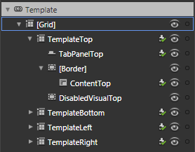

Parts of a ListBox
A list box has a number of templates that it uses and it's important to get a good understanding of how it hangs together. Here is the break-down:


A list box has a control template that contains a ScrollViewer control. A ScrollView control has a control template that contains two ScrollBar controls. And the ScrollBar controls have their own template as well (which is divided up into horizontal and vertical elements).

Additionally, the ListBox uses two other templates (there is a third that is not part of the reusable style that we will discuss briefly at the end): another control Template (inside the ListBox.ItemContainerStyle) that determines what the items in the ListBox look like, and an ItemsPanelTemplate (ListBox.ItemsPanel) that determines how the items are laid out (eg horizontally, vertically etc).

When you are looking at a styled ListBox, the items in the list look the way they do because of the ListBox.ItemContainerStyle template, which is a ControlTemplate. They are laid out the way they are (usually vertically) because of the ListBox.ItemsPanel which is an ItemsPanelTemplate that contains a stack panel by default, and they are "framed" the way they are (the background, scrollbars etc) because of the ListBox.Template which is a ControlTemplate. We won't bother changing the ListBox.ItemsPanel in this post since we still want the behavior that we get with the default vertical StackPanel.

The ScrollBar
It's easy to get lost in template editing if you dig down and down through the control templates. We are going to approach things in a fairly simple-to-follow way by styling the resources we need from the innermost controls, and work our way back up to the top level control. The first control, buried deep inside the ListBox control, is a ScrollBar. Strangely enough, the ScrollBar is probably the most time consuming of the controls we will style even though it seems a simple control. You'll see why as we go along.

Drag a scroll bar onto our glassy panel - it will be vertical by default. Use the breadcrumb toolbar to edit a copy of the control tempate; call it ScrollBarChromeStyle and remember to save it in our ChromeGlass.xaml resource dictionary.

The template doesn't have any size defined, but Blend allows us to define a Design-Time only size. Select the "Root" element in the Object tree and use the bottom blue drag handle to make our scroll bar a bit taller.

If you expand the "VerticalRoot" element you will see that the scroll bar is made up from three rectangles and five controls. We are only going to need two of those rectangles, so delete the second one in the Object tree under the "VerticalRoot" grid. Set the Fill of the first Rectangle to our GlassFill resource brush, and the stroke of the second Rectangle to the "ChromeBorder" resource brush we defined in Part 1.

Select the "VerticalSmallDecrease" element - it's a RepeatButton control, as are the other small and large decrease buttons. Use the breadcrumb toolbar to edit the current control template. The Repeat button is a specialized kind of button that does not contain any content of its own (like a regular Button does), but still has button states. Select the "Background" rectangle element, change its Fill brush to the "ChromeGlass" resource brush, it's Stroke to empty, and its Opacity to 100%.

Select the "BackgroundMouseOver" Rectangle element, change its Fill to empty, and its Stroke brush to the "ChromeBorder" resource brush.

Select the "BackgroundGradient" Rectangle element, drag it up to be above the "BackgroundPressed" Rectangle in the Object tree, and change to following properties (don't worry about any warnings of animations being removed):
  • Set its Fill to the "ChromeFill" resource brush
  • Set its Stroke to the "ChromeBorder" resource brush
  • Set its Margin to 2 for all edges

Select the "BackgroundPressed" Rectangle element and change its Margin values to 2 for all edges. Select the "Highlight" Rectangle element and change its Margin to 0 for all edges.

Finally, select the unnamed path element and change it's foreground to White. Now to set the values for the different states.

Select the "MouseOver" state (in the "States" tab) and change the Opacity of the "Background" Rectangle to 0%. Select the "Pressed" state and set the Opacity for the "Background" element to 0%, the "BackgroundGradient" element to 100%, the "BackgroundPressed" element to 20%, and the "Highlight" element to 20%.

The good news is, that the VerticalSmallDecrease element is now styled. The bad news is, that we have to repeat this process for the VerticalSmallIncrease the HorizontalSmallDecrease, and the HorizontalSmallIncrease. Since the VerticalSmallIncrease element is essentially the same as the VerticalSmallDecrease element, I won't bother repeating the same instructions. Go ahead and follow the same instructions for the VerticalSmallIncrease RepeatButton; I'll wait for you...

...and we're back. Now lets style the "VerticalThumb" element. Select it and use the breadcrumb toolbar to edit the current template. You should see it's made up of nothing more than five Rectangle elements. Here we go (you may wish to select the top Grid element and use the Design Time size handles so you can see what the changes look like):

Change the "Background" element's Fill brush to empty, and its Stroke to the "ChromeBorder" resource.

Move the "BackgroundGradient" element up under the "Background" element, change its Fill to the "ChromeFill" resource and its Stroke to the "ChromeBorder" resource, and set its margin to 2 for all edges.

Change the "BackgroundMouseOver" element's Fill to White, its stroke to empty, and it's Margin to 2 for all edges.

Change the "Highlight" element's Margin to 0 for all edges.

Select the "MouseOver" state, and change the "BackgroundMouseOver" element's Opacity to 20%. Select the "Pressed" state and change the "BackgroundPressed" element's Opacity to 30% and the "Highlight" element's Opacity to 30%.

That's the vertical layout elements styled; now we have to do the horizontal layout elements. Normally, the easiest way to style the horizontal layout would be to click the "[scrollbar]" button on the breadcrumb trail and change the Orientation of the ScrollBar to Horizontal (you will want to resize it too), and then use the breadcrumb trail to go back into the template and expand the "HorizontalRoot" grid element.

However, at this point Blend seems determined to make things hard for us; it insists on only showing the design template for the vertical orientation regardless of the value of the Orientation property. So we are going to have to do this blind, but we will be guided by what we have done with the vertical scrollbar. You can also switch back and forth between "ChromeGlass.xaml" and "MainPage.xaml" to see the results of your changes. If we had chosen to save the template in "MainPage.xaml" instead of our resource dictionary then we would have been editing "in-place" and would be able to see our changes reflected in the design surface. We probably should have done that, and then moved the template into the resource dictionary when we had finished.

Here are the steps for the "HorizontalRoot" template:

Horizontal Root
  • Delete the second Rectangle element - we don't need it, there should be three left.

  • Set the Fill brush for the first Rectangle to the "GlassFill" resource brush.


HorizontalSmallDecrease
  • Select the "HorizontalSmallDecrease" element and use the breadcrumb trail to edit it's template.
  • Select the "Background" Rectangle element and set its Fill to the "ChromeGlassFill" resource brush, its stoke to "No brush", and its Opacity to 100%.
  • Select the "BackgroundMouseOver" Rectangle element and set its Fill to "No brush" and it's Stroke to the "ChromeBorder" resource brush.
  • Select the "BackgroundPressed" Rectangle element and set its Margin to 2 for all edges.
  • Select the "BackgroundGradient" Rectangle, drag it up in the Objects tree to be above the BackgroundPressed Rectangle, set its Fill to the "ChromeFill" resource brush, its Stroke to the "ChromeBorder" resource brush, and it's Margin to 2 for all edges.
  • Select the "MouseOver" state and set the Opacity of the "Background" Rectangle to 0%, the "BackgroundMouseOver" Rectangle to 100%, and the "BackgroundGradient" Rectangle to 100%.
  • Select the "Pressed" state and set the Opacity of the "Background" Rectangle to 0%, the "BackgroundGradient" Rectangle to 100%, the "BackgroundPressed" Rectangle to 20%, and the "Highlight" Rectangle to 30%.
  • Select the "Highlight" Rectangle element and set its Margin to 0 for all edges.
  • Select the "[Path]" element and set it's Fill to a solid white color.


HorizontalSmallIncrease
Use the breadcrumb trail to go back out to the scrollbar template, select the "HorizontalSmallIncrease" element. For some strange reason, this one template is implemented differently by default than the other 3 small increase RepeatButton elements in the ScrollBar template. There is no "BackgroundPressed" Rectangle element, so select the "BackgroundGradient" Rectangle, press Ctrl+C followed by Ctrl+V to create a copy, select the copy, click its name once and rename it to "BackgroundPressed". Drag it up so it sits just below the "BackgroundGradient" Rectangle, and set its Fill to a solid color with the value "#FF448DCA", its stroke to "#00000000", and its margin to 2 for all edges. Also change the name of the "BackgroundAnimation" Rectangle to "BackgroundMouseOver". You can now follow the same steps as for the "HorizontalSmallDecrease" element, with one additional step: in the "Pressed" state, you will have to set the Opacity for the (now named) "BackgroundMouseOver" element to 0%.

HorizontalThumb
You can follow the same steps for the "VerticalThumb" element to style the "HorizontalThumb".


That's the hard work done, the rest of the ListBox template styling goes quickly now.

The ScrollViewer
Go back out to MainPage.xaml design surface and place a ScrollViewer control inside the grid containing our other controls. The ScrollViewer isn't available on the control toolbar fly-outs so you can either use the ">>" chevron at the bottom of the toolbar to list all controls and find the ScrollViewer in there, or you can select the "Assets" tab and enter "scroll" into the search box and Blend will filter all available controls that contain the search term:


Once you have created the scroll viewer, use the breadcrumb trail to edit a copy of its template, saving it as "ScrollViewerChromeStyle" in the "ChromeGlass.xaml" resource dictionary.

The only thing we need to change in the template is the style of the scroll bars. We can do that by right-clicking the VerticalScrollBar element, and selecting "Edit Template" | "Apply Resource" | "ScrollBarChromeStyle". Do the same to the HorizontalScrollBar. Now select the "[Rectangle]" element and delete it. That's it for the template, we just need to set the border brush on the style resource.

Click the artist's palette on the breadcrumb toolbar to edit the style of the ScrollViewer and change it's Border to the "ChromeBorder" resource brush. We also want to have the inside of the ScrollViewer subtly differentiated from the outside of it so set its Background brush to a "#26000000" Solid brush. The style may show the foreground as Black, but since we have applied a White Foreground to our UserControl, the foreground will default to White when we actually use the control in our MainPage.xaml.

That's the ScrollViewer done. Here is what it looks like on our main page, with a couple of Scrollbars too:


We could have used the "GlassFill" resource brush for the background of the scrollable area, but the ScrollViewer is going to be used in the ListBox template, and the angled shine of the Glassfill brush would end up looking odd with multiple ListBox elements of different sizes on the same screen, since the shine would be at different angles depending on the size of the ListBox.

The Listbox Control Template
Finally, we get to the ListBox control. There are two templates we need to edit here, the control template for the ListBox, and the ListBoxItem template that will hold each item in the ListBox.

You can delete the ScrollViewer control on the MainPage.xaml screen and replace it with a ListBox control. Create a new resource template for the ListBox called "ListBoxChromeStyle" in the "ChromeGlass" resource dictionary.

Expand the template in the Objects tree and right click the "ScrollViewer" element. Select "Edit Template" | "Apply Resource" | "ScrollViewerChromeStyle". You will see that the background is still white from the default template because the Background brush is template-bound to the parent Background brush for the ListBox control. We could reset the Background brush for the ScrollViewer, but that would mean that any changes we make to the Background brush would be ignored for individual ListBox controls that use this style. So select the artists palette on the Breadcrumb toolbar for the actual Style of the ListBox and set the Background to a solid color of "#22000000" - the same that we used for the ScrollViewer style template. The Border brush of the "[Border]" element in the ListBox template is also template-bound to the style, so change the style's BorderBrush to the "ChromeBorder" resource brush. The Foreground color of the parent control is not passed onto child ListBoxItems, so set the Foreground of the ListBox style to white.

That's the main chrome of the ListBox done, so now lets do the ItemContainerStyle.

The ItemContainerStyle
Go back out to the MainPage.xaml view and select the ListBox. Use the breadcrumb trail to edit, under "Edit Additional Templates", a new copy of the "Generated Item Container". Call it "ListBoxItemChromeStyle" and save it in the resource dictionary.

Select the "fillColor" Rectangle element and change its Fill the the "ChromeGlassFill" resource brush. Select the "fillColor2" Rectangle element and change its Fill also to the "ChromeGlassFill" resource brush, and it's Stroke to the "ChromeBorder" resource brush. Select all three Rectangle elements by holding Ctrl and clicking on each one, and change the RadiusX and RadiusY values to 3.

Now select the "MouseOver" State, and set the Opacity of the "fillColor" Rectangle to 50%. Select the "Focused" State and set the Opacity of the "FocusVisualElement" Rectangle to 30%. Select the "Selected" State and set the Opacity of the "fillColor2" Rectangle to 100%. Finally, select the "Disabled" State, delete the Opacity adjustment for the "contentPresenter" element and set the Opacity of the "grid" element to 55%.

One thing that has always annoyed me about the list box is that the default template for the ListBoxItem has the HorizontalAlignment set to Left - which means that the selected item highlight doesn't stretch across the whole ListBox. To change this, select the "contentPresenter" element and use the Advanced Property Options box to reset it's HorizontalAlignment, and then change it to Stretch instead of Left.

That was the last part of the reusable ListBox template that we needed to style, but there is one more thing to do. Currently, the ListBox control that we created has its "ItemContainerStyle" property set to the "ListBoxItemChromeStyle" resource that we just created. But we really want this to be set on the "ListBoxChromeStyle" style resource rather than on the ListBox itself. So select the ListBox, and from the "Object" menu, select "Edit Style" | "Edit Current" to edit the "ListBoxChromeStyle" resource. Expand the "Miscellaneous" group heading and, from the advanced property options box on the right hand side of the "ItemContainerStyle" property, select the local resource "ListBoxItemChromeStyle". Finally, exit out of editing the template and, back on the ListBox itself, use the advanced property options to reset the value of the ListBox's "ItemContainerStyle" property. So now, whenever we use our "ListBoxChromeStyle" resource, it comes already connected to the "ListBoxItemChromeStyle" resource.

That is the last thing we needed to do to our ListBox style, so now lets add some sample data to test it with.

Adding Sample Data
Blend has built in functionality to create sample data that we can use when designing our layouts to test how those layouts work with actual data.


Select the "Data" tab and click the "Add sample data source" button. Select the "Define New Sample Data..." option and accept the default Data source name "SampleDataSource", creating it in the Project, not the Document.

Blend will have created two fields for you by default. You can use the little arrow on the right edge of the property to change what kind of sample data is generated. Rename the two fields "Name" and "Company" and add a third one named "Image". Use the "Change Property type" arrows to select the right kind of data to be generated for each field.

To bind the generated data to your ListBox, click and drag the "Collection" item in the SampleDataSource tree onto the ListBox. Blend will automatically create a data template for it and show the data stacked vertically in a StackPanel control, but we're going to change that now.

Editing the ItemTemplate
The last template is the Listbox.ItemTemplate. It is a DataTemplate that will be applied to the data inside each ListItemBox. It has nothing to do with our reusable "ListBoxChromeStyle" resource, and is something that you customize specifically for each ListBox you use. I'm covering it briefly here just for the sake of putting all the ListBox templates in context.

Use the Breadcrumb toolbar to edit the current "Generated Items (ItemTemplate)". I'm not going to give any instructions on what to do here since it is unrelated to our style sheet. Just find a nice layout for the items that are there, or grab my one using the link at the end of this post. You will notice that you are editing this template "in-place" since it was created inside the MainPage.xaml file, rather than the resource dictionary.

So here are the things we have covered in this post:
  • It's easier, with complex controls, to style the child controls that it uses first.
  • The different templates that make up the list box and how they relate to each other.
  • How to create reusable styles and templates for each of them.
  • The ListBox.ItemTemplate is specific to each instance of a ListBox, so it's not part of our resource dictionary.

You can grab the final solution files here.

Wednesday, April 7, 2010

A Chrome and Glass Theme - Part 3

In the first two parts I covered how to use Blend to create reusable resources for brushes and styles, and we styled a Border control and a Button control.

In this post we are going to style two more relatively simple controls: a TextBox, and a CheckBox. So start by re-opening your solution from last time (you can grab it here if you haven't been following along). This is what the final styles will look like:


You can grab the solution containing these styles here.

First: Improve the Button
But first, I want to quickly revisit the Button style we created last time - after playing around with it some more, I don't like the way it looks when it's disabled. We didn't change the default disabled state appearance, which grays-out the control by changing the opacity of the "DisabledVisualElement" rectangle. The problem is that when the button is disabled, it actually stands out more than any enabled buttons around it - which it shouldn't.

To fix it, we are going to give it a glassy look when it's disabled.

Select the button we created last time and use the bread crumb trail to edit the control template. Open up the Object tree and select the grid control under the "Background" Border control. Click the Advanced Properties Options button on the right of the Background brush and select "Reset" to get rid of the link to the template background color.

Select the "DisabledVisualElement" and change it's Fill to a linear gradient with the following markers:
  1. #FFFFFFFF Position: 12.7%
  2. #FFCDCDCD Position 32.8%
  3. #FF898989 Position 35.2%
  4. #FFC2C2C2 Position 39.6%
  5. #FFB3B3B3 Position 49.3%
  6. #FFFFFFFF Position 52.4%
  7. #FF252525 Position 55.6%
  8. #FF808080 Position 100%
And click the little down arrow below the brush editor to show the advanced properties of the gradient brush, and change the Opacity of the whole brush (not the rectangle) to 31%. Now convert that to a new resource called "ChromeGlassFill" in our ChromeGlass resource dictionary.

Finally, select the "Disabled" state, set the Opacity of the BackgroundGradient rectangle to 0%, the Opacity of the DisabledVisualElement rectangle to 100%, and the Opacity of the ContentPresenter to 50%. And set the margins of the DisabledVisualElement to 2. Use the Bread Crumb Trail to exit the style template back into the MainPage. The image to the left shows the button now in it's different enabled states.

The TextBox Control
Before we create a TextBox control we have to group our existing button into a Grid since a Border can only contain one control. Right click the button and press Ctrl + G to group it into a Grid control. Blend will have set the margins on the grid to fit exactly around the button, and changed the button horizontal and vertical alignments to Stretch so reset the margins of the new Grid back to 0, make sure the horizontal and vertical alignments are both Stretch, and the Width and Height are both Auto. Of course now our button takes up the entire grid, so change it's width back to 140, and it's height back to 30. And drag it back into place.

Now add a TextBox control to the Grid, make it about the same size as the button. From the Object menu, select "Edit Style" | "Edit Copy..." and save it as "TextBloxGlassyStyle" in our ChromeGlass resource dictionary. Set it's Background brush to our new "ChromeGlassFill" brush, and it's border to the "ChromeBorder" fill. Set the Foreground brush to a white solid color, the CaretBrush to a white solid color, and the SelectionForeground to black.

Now use the Breadcrumb Trail to edit the current template and open up the object tree. Select the self-named "Border" control and reset it's Background brush to be empty - we are going to animate the opacity of the background, but if we do it on the Border then it will also affect it's child controls.

Create two new rectangles inside the Grid called "UnfocusedBackground" and "EditingBackground" positioned as the first children of the grid as shown in the image to the left. Make sure the margins of the rectangles are reset to 0, the horizontal and vertical alignments are set to Stretch, and the Width and Height set to Auto.

Select the UnfocusedBackground rectangle and use the Advanced Property Options button on it's Fill to use Template Binding to the Template's Background property. Set it's stroke to No Brush.

Select the EditingBackground rectangle, set it's Fill to #4CFFFFFF, and it's Opacity to 0%.

Make the following changes to the Focused State:
  • Set the UnfocusedBackground Opacity to 0%
  • Set the EditingBackground Opacity to 100%
  • Set the FocusVisualElement Opacity to 50%
  • Set the FocusVisualElement Margins all to 0
And these changes to the Disabled State:
  • Set the Border Opacity to 75%
  • Set the ContentElement Opacity to 50%
  • Set the DisabledVisualElement Opacity to 0%

That's our TextBox done. Exit the Style Template and run the solution to try it out.


The CheckBox Control
Create a CheckBox control and use the same technique as for the TextBox control to create a style called "CheckBoxGlassyStyle" in our resource dictionary.

While editing the style, set the BorderBrush to our ChromeBorder LinearBrush resource and set the Foreground to White. Now use the Breadcrumb Trail to edit the control template and make the following changes to the controls inside the template (you can ignore the warnings about animations being removed):
  • Set the Background control's Fill to our GlassFill resource
  • Set the BoxMiddleBackground control's Fill to our ChromeFill resource (you will have to Reset it first)
  • Set the BoxMiddle control's Fill to our ChromeGlassFill resource and it's Stroke to our GlassBorder resource
  • Set the CheckIcon control's Fill to white
  • Set the IndeterminateIcon control's Fill to our ChromeFill resource
You can see the benefit of saving our linear gradient brushes as resources - that saves us a lot of time!

Now we just need to update the states:

MouseOver State
  • Set the BackgroundOverlay Opacity to 30%
  • Set the BoxMiddleBackground Opacity to 30%
Pressed State
  • Set the BackgroundOverlay Opacity to 0%
  • Set the BoxMiddleBackground Opacity to 100%
Focused State
  • Set the ContentFocusVisualElement Opacity to 50%
And that's it! Exit the template back into the Main Page and run your solution.

In the sample at the top of the post I've bound the IsEnabled property of the TextBox and Button to the CheckBox so you can see what they look like disabled.

You can grab the solution containing the above styles here.

Saturday, April 3, 2010

A Chrome and Glass Theme - Part 2

Well - it's a long weekend here in New Zealand due to the Easter holidays, so I have some spare time to do another post in this series earlier than I would otherwise have had.

In the last post we created a resource dictionary and defined some brush and style resources to create a glassy panel. In this post we are going to define some more brush and resource styles for a chrome looking button. Here is what the button will look like:

Open up the solution from the last post - if you haven't been following along so far, you can grab the solution so far here.

Editing the Button Style
Select the Border control and create a button inside it about 140x30 in size. Click the "[Button]" button on the breadcrumb trail bar and edit a copy of the button template. Call the new style "ButtonChromeStyle" and be sure to select the "Resource Dictionary" option to create it in our ChromeGlass resource dictionary.

Blend has created a copy of the default style and control template of the button. But before we change the appearance of the elements inside the control template, click the "artists palette" icon in the breadcrumb trail so that we are editing the style itself, and not the control template inside the style.

We are going to define the chrome-looking border so select the BorderBrush property on the Properties tab. The button already has a linear gradient so add 3 more markers to the three already there and define the locations and colors as follows:
  1. #FFDCDCDC Position 0%
  2. #FF656565 Position 44.8%
  3. #FFD8D8D8 Position 68.9%
  4. #FF2B2B2B Position 92.6%
  5. #FFE9E9E9 Position 94.8%
  6. #FF494949 Position 97.2%
We are going to want to reuse this brush again so click the Advanced Properties Options button on the right of the BorderBrush property and select "Convert to new resource...". Call it "ChromeBorder".

Select the Foreground property on the style and change it to white - for some reason, the Button control doesn't seem to inherit the white foreground we set on the UserControlStyle from Part 1 in this series, so we must set it on the style.

Editing the Control Template
Now click the "Template" button on the breadcrumb trail to go back to editing the template which looks like the picture on the left.

Select the Background border element in the object tree and select it's BorderBrush. The BorderBrush is bound to the template style that we defined on the actual style - which is the chrome border. Blend sometimes gets confused so if it still shows the old blue linear gradient, don't worry; when we compile and run the solution it will do the right thing.

Now select the Background property and change the "A" (Alpha) value to zero, which should leave a transparent gap inside the button border.

We're going to define our Chrome gradient for the inside of the button so select the BackgroundGradient rectangle in the Object tree and select it's Fill property which is already a linear gradient. The button states (which we will get into later) contain some animation settings for the markers in this existing gradient. We want to clear them and the easiest way to do that is to change it to a solid color, and then change it back to a linear gradient. When you do this you will see a warning appear briefly at the top of the design area warning you that some animations have been deleted. Which is what we want.

Change the color and position of the 5 markers on the linear gradient to these values:
  1. #FFFFFFFF Position 12.7%
  2. #FF878787 Position 51.6%
  3. #FF393939 Position 53.2%
  4. #FF858585 Position 94.8%
  5. #FFFFFFFF Position 100%
And change the RadiusX and RadiusY properties both to 2. Also change the CornerRadius of the BackgroundAnimation border element to 2.

Again, we are going to reuse this gradient later so select the BackgroundGradient element (if it's not already selected), click the Advanced Property Options button and convert it to a local resource called "ChromeFill".

Although we are going to reuse this gradient, it's a little bit to bright for the button since we have specified White as the foreground (text) color on the style. We are going to use another rectangle in the button template to correct this rather than change the gradient brush resource we just created.

Select the [Grid] control inside the Background border control in the object tree, and double click the Rectangle icon on the tool palette. Reset it's margin property (which Blend has probably changed) all to 0s and set it's Stroke property to NoBrush. Also, change it's RadiusX and RadiusY values to 2.

Select it's Fill property and set it to be a linear gradient brush with the following 3 markers:
  1. #4C5F5F5F Position 0%
  2. #4CDCDCDC Position 23.4%
  3. #4C000000 Position 65.7%
We may need to use this gradient again so convert it to a local resource called "ChromeDarkeningLinear" (yup - we are going to create a radial one in a later post). The white text back on the button will now show clearly against the background.

Changing the Visual States
The last thing to do is to change the appearance for the various states that the button can be in. Click the "States" tab and you will see all the various states that a button can be in.

Select the "MouseOver" state - any changes we make to element properties now will only take effect when the mouse is over the control (in the running application). The BackgroundAnimation element already has an animation to change the opacity from 0 to 100 (it has the little red circle on it's icon in the object tree), so select the BackgroundGradient element in the Object tree and change it's opacity to 85%. This will allow a bluish color to show through.

Select the "Pressed" state. There will already be an animation for the Background border element (near the top of the object tree), but we want to change it:

  • Select the Background border element and set it's background brush to black, but change the A value to 50%.
  • Select the BackgroundAnimation element and change it's Opacity to 50%
  • Select the BackgroundGradient element and change it's Opacity to 50%
The last thing to do is to introduce a small animation to move between the Normal and MouseOver states a little more smoothly. Click the down arrow on the "Normal" state and choose the "Normal -> MouseOver" menu item. Set the transition duration that appears to 0.2. Now do the same for the MouseOver state (choosing the "MouseOver -> Normal" item).

Make sure you save your progress, and click the "[Button]" button on the breadcrumb bar to go back out to our main design area. That's the button finished, so run your application and try it out. The final design area should look something like this:

You can download a project containing the above resources here.

In the next post we are going to

Thursday, April 1, 2010

A Chrome and Glass Theme - Part I

This is the first in a series of posts that will cover how to build a nice looking chrome and glass theme. The chrome style will be applied to controls and the glass look will be a balancing style to avoid an overload of shiny; it will also give us a nice gentle background appearance.

In this post we are going to define some gradients and color resources for a glass style that can be applied to a Border control. Here is what the finished button will look like:


We are going to end up with a resource dictionary that we can use with both the ImplicitStyleManager from the Silverlight Toolkit for Silverlight 3, or directly with Silverlight 4. The only difference between the two approaches is that we don't need to add the x:Key="StyleKeyName" attribute on each style, or set the Style property on each control if we want to use it in Silverlight 4.

Setting up our Theme
First we need to create our solution. Start Blend and create a new project (call it something like "ChromeAndGlassTheme". Under the Project menu select "Add new item...", and add a new Resource Dictionary called "ChromeGlass.xaml".

Styling From the Top
The first thing we want to define is the foreground color for text on most of the controls styles we will end up with - which will be white. So select the "[User Control]" root in the Objects tree, and change the foreground to white. We want this setting to be part of the resource dictionary we created, so we do the following to achieve that:
  1. Click the "Advanced Property Options" button (the little square button to the right of the Foreground box)
  2. Select "Convert to New Resource..."
  3. Give it the name (key) "WhiteForeground"
  4. Choose "Resource Dictionary" for the location to define it
  5. Click OK
Since we only have the one Resource Dictionary, it will have created the entry in the ChromeGlass.xaml.

Next, with the "[User Control]" still selected, open the "Object" menu and select the "Edit Style | Create Empty..." menus. Call the style "UserControlChromeStyle", make sure it is created in our ChromeGlass resource dictionary, and click OK. We are now editing the style resource, not the control. On the properties tab click the Advanced Property Options button for the foreground and select the "Local Resource" sub menu, and choose our "WhiteForeground" resource.

Why have we set this on the UserControl? So that we don't need to explicitly set the foreground color for our child controls (such as labels and buttons); Silverlight will search up to see if any of the parent controls have their foregrounds explicitly set before going back to the default value for the control. So since we have set the style of the UserControl to have it's foreground white, all child controls that we place inside it will use WhiteForeground unless we set them otherwise.

Now select the "LayoutRoot" grid and set it's background to black. We could have created a style like we did for the UserControl, but background is not one of the values that is propagated to child controls - and we won't want it passed down anyway.

The Gradients
Our chrome and glass styles are going to rely heavily on a couple of gradient brush resources we are going to define. First lets create the glass panel that can contain our controls. Create a new Border element and make it about 300px wide and about 120px high. Before we create a style for it, we should clear any changes that Blend has already made to the Border's properties. Click the Advanced Property Options box to the right of the Background property and select "Reset". Do this also for the BorderBrush, BorderThickness, and CorderRadius properties.

Now create a new empty style for it like we did for the UserControl - call it "BorderGlassStyle" and be sure to create it in our resource dictionary.

Select the "BorderBrush" property and select the Gradient Brush option below it. The gradient bar will have two markers - one at each end. Select the left marker and change it's color to White (both markers should now be white). Add another 7 markers by clicking on the gradient bar between the existing markers and set the following values for each marker (1 is leftmost, 9 is rightmost. The "Alpha" refers to the "A" part of the color):
  1. position: 0%. Alpha: 60%
  2. position: 8.5%. Alpha: 0%
  3. position: 37.6. Alpha: 20%
  4. position 41.8%. Alpha: 60%
  5. position 47.7%. Alpha: 20%
  6. position 60.5%. Alpha: 0%
  7. position 76.5%. Alpha: 20%
  8. position 80.7%. Alpha: 50%
  9. position 100%. Alpha: 5%
If you click the down-pointing arrow below the gradient bar you will see some other values we can set for this gradient. Set the the start and end points as follows:
  • Start Point: 0.013, 0.036
  • End Point: 1, 1.005
And set the Border Thickness to 2 for each edge and a Corner Radius of 8. This will make our border look like it is reflecting shafts of light.

We are going to reuse this glassy border brush again, so click the Advanced Property Options button for the BorderBrush property and convert it to a new resource called "GlassBorder".

Since we are editing the style resource, not the Border control itself, lets pop back out to the border to see what it looks like. You can do that by clicking on the "[Border]" part of the Style path at the top of the editing window:


Now we are back in our MainPage file with the Border control selected. Click the little Pac-Man (ok - it's an artist's pallet) shape to go back to editing the style. Now let's create a glassy border for the background.

Select the Background property of the style and again select the Linear Gradient option. We want a total of 5 markers on this gradient. This time we will set the hex values for each of the markers as follows:
  1. #26FFFFFF position: 0%
  2. #194C4C4C position: 40.4%
  3. #19FFFFFF position: 61.4%
  4. #4DFFFFFF position: 71.5%
  5. #18FFFFFF position: 100%
Also set the start and end points to the following:
  • Start point: 0.388, -0.015
  • End point: 0.769, 0.922
You can jump back out of the style now and see what the finished style looks like:

You can download a project containing the above resources here.

In the next post we will create the chrome gradients we are going to need for our controls and create our first control style for the Button control.