The project I'm currently working on has several views that contain lists of things in a DataGrid. We have a tool bar above each table in which we placed a label (that said "Filter : ") followed by a text box for entering text that would cause the list of items to be filtered to only those items containing the filter text, in one of a couple of the displayed columns.
That extra label was taking up some precious screen real estate so it had to go. What we really wanted was a TextBox with a watermark that disappears when it get's the focus or when it contains text. It would look like this when it is empty:
Because it is a filter text box I want a quick and easy way to clear it too. I don't want to have to click in it, select the text, and press the delete key just to clear it. So I want to add a button inside the text box that clears the text when the button is clicked. But I only want the button to appear when there is text inside the text box. It would look like this with text in it:
There are two ways to go about this: Create a UserControl, or create a templated custom control. In this post, and the next, we will create a UserControl since it is the easiest. I want to come back another day to do the templated custom control
Part I
In this first post we will create all the visual elements. The second post will be about creating some properties for binding, and the code to support those properties. The final result can be downloaded from
here.
Start a new project in Blend. Select the "Silverlight 3 Application + Website" template. With your new solution, right click the first project in the solution and select "Add New Item...". Select "UserControl" if it's not already selected, give it the name "WatermarkedTextbox" and click OK.

In the Objects and Timeline panel, select the "UserControl" item at the top of the tree view. By default Blend starts you off with a design time size of 640 by 480. To set this to something more practical for this control (200 by 24 should be fine) just grab the design-time resize handle and drag it towards the top left corner of the box - you should see the Width and Height properties in the Properties panel change as you drag it. Stop dragging when the Width and Height end up at 200 and 24 respectively.
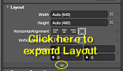
First though, we need to add some columns to the LayoutRoot grid. Select the "LayoutRoot" grid in the Objects and Timeline panel, and in the Properties panel, click on the expand button at the bottom of the Layout group.
This will show some more layout properties including "ColumnDefinitions (Collection)". Click the button with the ellipses next to this property to bring up the ColumnDefinitionsCollection Editor.
Use the editor to add two columns. Leave the width of the first column (it should be set to 1 Star), but set the width of the second column to 17 pixels. That second column is going to hold our button for clearing the text from the TextBox.
So now with our two columns in place we are ready to add our controls.
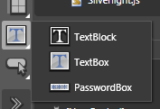
Select the TextBox icon from the text controls flyout on the Blend Tools toolbar (usually on the left of the screen). You can get this flyout by clicking and holding the displayed text control icon as shown in the picture.
Once it's selected, double click it. This will add a new TextBox control to the Layout grid since we had the grid selected when we double clicked. When the TextBox appears Blend swaps into edit mode and has the text "TextBox" already selected and ready for editing in the new TextBox control. Just hit escape for now to leave edit mode. We'll come back later and change that.
Now, with the TextBox control selected in the Objects tree, use the Properties panel to change the default value of HorizontalAlignment to "Stretch", and ColumnSpan to 2. You should end up with a design surface that looks like this:
Now we want to add our watermark. Select the "Layout" grid again, select the "TextBlock" control from the text flyout, then double click the TextBlock icon to create a TextBlock in the grid. Again, Blend will enter edit mode for the TextBlock control so just click escape to exit - we'll come back to this control later.
Blend will have automatically set some values in one or more of the Margin property values for the new TextBlock. Set all of the margins back to 0 except for the left margin - set that to 3, and change the VerticalAlignment to Center. We want the appearance of the watermark to be a little different than the TextBox text, so in the Text group on the Properties panel, click the italics button on, and up in the Brushes group set the Foreground color to something like #FF868686.
Now we can create the button to clear the text from the TextBox. We are going to make it out of two controls; an ellipse and an "x" that we convert to a path. First, select the LayoutRoot grid again, then select the ellipse from the shape flyout on the Tools toolbar and double click it to create a new ellipse. Again, reset all the margins back to 0. Change the Column property to 1, the Width to 14, the Height to 14, the Fill Brush to #FF787878, and the Stroke Brush to #FF494949.
Select the LayoutRoot grid again and add a TextBlock. Change the text of the new TextBlock to lowercase "x" (remember that to exit the text editing mode press escape, not enter) and set the font size to 8. Right click the TextBlock and select "Path" -> "Convert to Path" to convert the text into a path shape. Set all the margins to 0, the Width and Height both to 5, the Horizontal and Vertical Alignments both to Center, the Column to 1, and the Fill color to white.
If you select the LayoutRoot grid again, you should have something like this:
Now select both the Ellipse and the Path in the Object tree (hold Ctrl down to select multiple items). Right click the selected controls and select "Group Into" -> "Grid", to wrap the two controls into a grid. Doing this will have set some default Margin values on the grid so reset them all back to 0. Now right click the new grid and select "Make Into Control...". The Make Into Control dialog will appear with a list of controls to choose from. Select the Button control and give it the name "ClearFilterButtonStyle" and click OK to turn it into a button style.
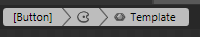
Blend has now put us into the template of the button style. The top left of the design surface shows three connected boxes showing us where we are editing. The button style is essentially a collection of property values that can be applied to a button. One of those properties is called "Template" which accepts a ControlTemplate. Blend has turned our grid containing the ellipse and path into a ControlTemplate for the button style. Part of that style includes a collection of states, which allow us to change the appearance of parts of our template as things happen to the button, such as when the mouse rolls over it. Don't worry about the "Button" text that has appeared, we will clean that up soon.
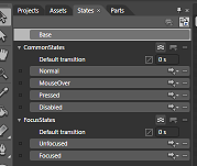
If it's not already showing, select the "States" tab. We want to change the appearance of our button to make it interact nicely with the user. Select the "MouseOver" state. A red border will appear around the design surface letting you know that Blend is recording property changes that are only applied when the control is in the MouseOver state. Now select the ellipse and change it's Fill color to #FFBD7777 and it's Stroke color to #FFD63030.
Right click the MouseOver state label and select "Copy State To" -> "Pressed". Select the "Pressed" state and change the path's Fill color to #FFD63030.
To exit editing the template, click the [Button] connected panel at the top left of the design surface, or click the "Return scope to [UserControl]" button at the very top of the Object tree panel. Now we are back editing the user control, clear the text from the Content property of the new button.
To finish up this post, let's name a couple of the controls. If you select a control in the Objects tree, and then single click it's name you can edit it. Change the TextBox name to "TextEntry", the TextBlock name to "WatermarkText", and the button to "ClearFilterButton".
In the next post, we will add some code in the code-behind file to make this user control actually do something.
You can jump ahead and grab the complete solution
here if you want to.


